Executive Summary
This story is built on the analysis in DataClinic Report #38. The subject is Forest Fire, a wildfire image dataset published on Kaggle. It holds three labels — fire, smoke, and normal — across 15,751 images in total. But of these photos gathered to detect fire, 82.8% were smoke, while actual fire came to just 7.2% (1,127 images). The thing that most needs to be detected was collected the least.
DataClinic first views the data through a 1,280-dimensional general-purpose lens (L2), then looks again through a specialized lens (L3) that keeps only the 17 dimensions that actually help tell the classes apart. This compression pulled apart a boundary where smoke and normal had been almost fully overlapping. And yet two scenes refused to resolve. The third "most smoke-like" view the AI found was a clear river with not a wisp of smoke (normal_457), and the fire it judged "least fire-like" was a grassland blaze buried under smoke (fire_392).
These two scenes foreshadow two failures pointing in opposite directions. A wildfire AI trained on this data will raise false alarms over a clear sky (false positives) and miss a grass fire that has just begun to spread (false negatives). In wildfire detection, where a miss costs lives and a false alarm costs trust, two opposite dangers sit side by side inside a single dataset. From here, we pull those two borderline scenes out one at a time, straight from the dataset's own images.
※ DataClinic's composite score and grade require authenticated access, so this story does not cover them. The diagnosis is based on the publicly available L1, L2, and L3 analysis content.
Forest Fire: 15,751 Images — What Was Collected
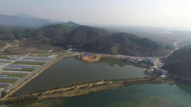
Forest Fire is a dataset assembled to build a model that automatically spots wildfires on screen. The labels are simple — three of them. Visible flames mean fire, visible smoke means smoke, and nothing unusual means normal. Aerial drone shots, forest surveillance-camera frames, and on-scene photos are all mixed together, so the shooting conditions vary widely.
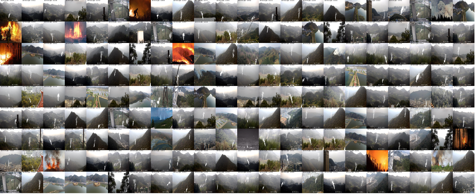
▲ Forest Fire dataset collage — close-up flames, haze over mountains, and calm landscapes all share one frame.
The first thing that stands out is the severe skew across the three classes. Smoke accounts for 13,045 images, or 82.8% of the total, while fire is just 1,127. Smoke outnumbers fire by 11.6×. This likely reflects the reality that smoke scenes are far easier to find than flames themselves when collecting wildfire data — but from an AI-training standpoint, it's a signal worth flagging.
▲ Class distribution. Bar length is each class's share of all 15,751 images (the three bars sum to 100%).
The rest of the basic checks come back fairly clean. Label consistency is fine, and there are no notable missing values. Image sizes range widely from 240px to 2000px across, and 99.76% of color channels are RGB — but 0.24% are RGBa, drawing a light caution. The source is the kutaykutlu/forest-fire dataset on Kaggle.
Three Average Faces — Level 1
Level 1 is a basic fitness test at the pixel level. Overlay every photo in a class and average them, and you get that class's "average face." The sharper the average image, the more consistent its composition and color; the blurrier it is, the more varied the photos inside. Below, each class's actual representative photo (left) sits next to its mean image (right).
 Actual
 Mean
Mean
 Actual
 Mean
Mean
 Actual
 Mean
Mean
▲ The left of each card is the actual representative photo; the right is the pixel-wise average of the whole class.
The three average faces split by color. Fire bunches orange at the center, smoke spreads grayish-white across the whole frame, and normal settles into greens and sky-blue. By color alone, the three look distinct enough. The problem is the boundary this "average of colors" hides. The grayish-white of smoke and the grayish-white of a calm landscape laced with fog or overcast sky are already alike at the averaging stage. How that resemblance spreads downstream is the spine of this story.
What 1,280 Dimensions Saw — Level 2
Level 2 views the data through the eyes of a general-purpose neural network called Wolfram ImageIdentify Net V2. Each photo turns into 1,280 numbers, with similar photos placed close together and different ones far apart. DataClinic marks how tightly packed each photo sits among its same-class neighbors as a "density." The higher the density, the closer that photo is to its class's typical form.
Look first at the overall density distribution and it's bimodal — two peaks. The lower, smaller peak is made mostly by fire; the higher, larger one by smoke and normal.
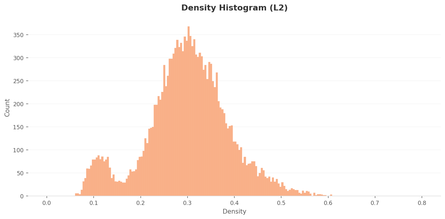
▲ L2 overall density distribution (range ~0.06–0.61). Fire clusters at the lower small peak; smoke and normal at the higher one.
Compare the median density per class and the problem sharpens. Fire sits clearly low at 0.11, while smoke is 0.30 and normal 0.33. The majority class, smoke, actually lands slightly below normal. More importantly, the gap between them is just 0.03. Through a 1,280-dimensional general-purpose lens, density alone makes smoke and normal practically impossible to separate.
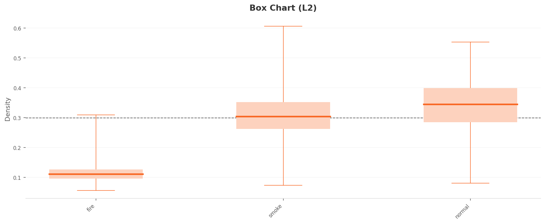
▲ L2 per-class density (box plot). The boxes for smoke (0.30) and normal (0.33) almost overlap. The boundary is blurry.
The same blur shows up in the spatial picture. The PCA below flattens 1,280 dimensions onto a plane. The points don't gather in any one place — they scatter evenly across the frame, so there's hardly any boundary to speak of between classes. Through the general-purpose lens, the wildfire data is still close to a "single undivided fog."
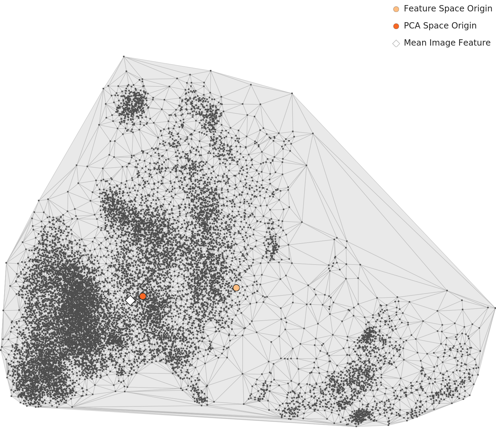
▲ L2 PCA. No distinct core cluster; points spread broadly — the boundary is still faint.
Compressed to 17 Dimensions — Level 3
Level 3 is a specialized lens that picks, from the 1,280 dimensions, only those that actually help distinguish the classes — narrowing them down to 17 dimensions. That's roughly 75× compression, but nothing was thrown away blindly: only the axes with a clear discriminating signal were kept. So when the same data is viewed again, the boundary comes out sharper.
The overall density distribution changes first. L2's two peaks vanish, tidying into a single bell-shaped peak bulging in the middle. (The density range grows from L2's to 1.7–9.3 here — about 15× larger — but this isn't because the data improved; it's a mathematical effect of points gathering into a tighter space. So you must not compare L2 and L3 density numbers directly — only within the same level.)
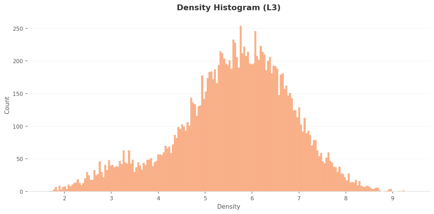
▲ L3 overall density distribution (range ~1.7–9.3). L2's two peaks tidy into a single bell-shaped peak.
Class separation improves noticeably. The medians spread to fire 3.0, normal 5.2, and smoke 5.9, making the order fire ≪ normal < smoke unmistakable. The smoke-to-normal gap, just 0.03 at L2, widens to about 0.6. The majority class, smoke, rises to the most typical position (highest density), finding its rightful place. Fire has the narrowest box — revealing that while typical flame photos resemble one another, there simply aren't many of them.
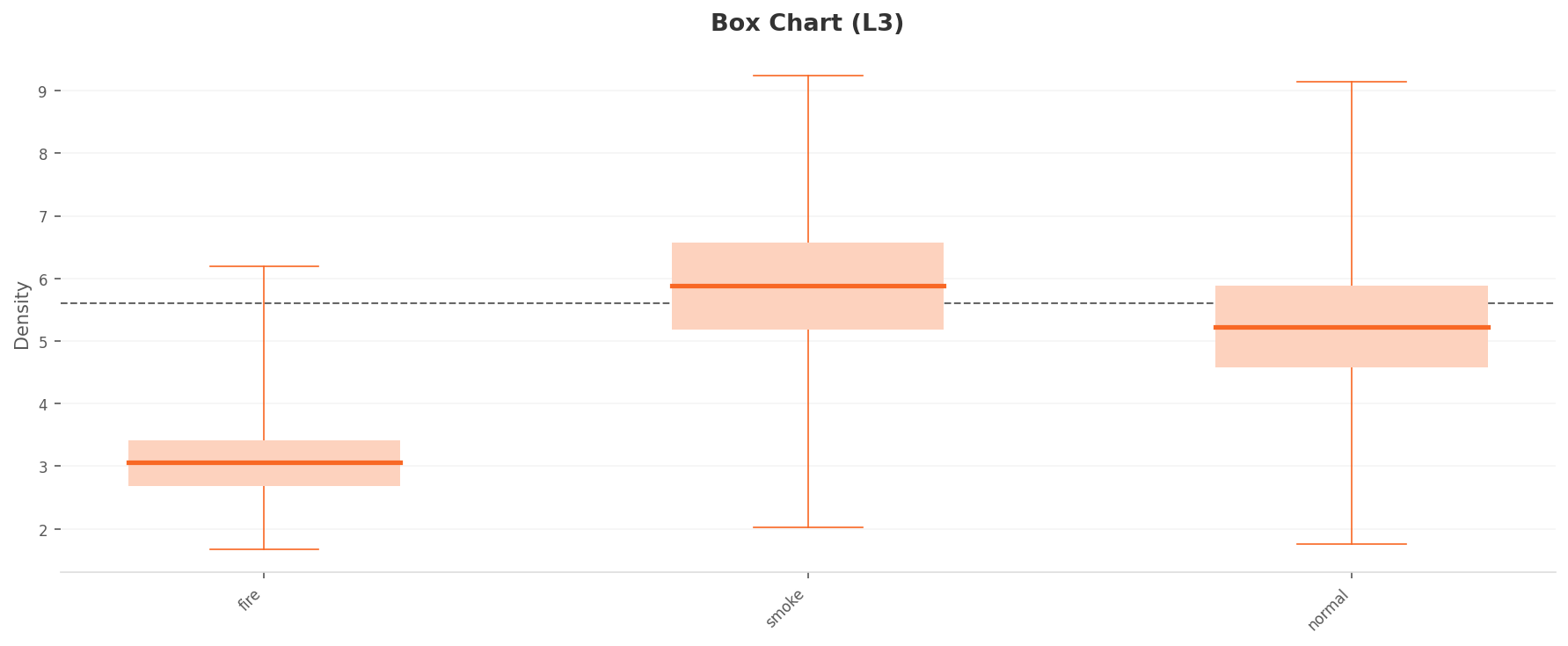
▲ L3 per-class density (box plot). Medians spread to fire (3.0), normal (5.2), smoke (5.9). The dashed line is the overall mean (~5.6).
The spatial picture is reorganized too. In the L3 PCA, a dense core of points forms at the lower right, while points thin out toward the left. L2's even fog becomes a structure of "one core + scatter." (The PCA points carry no class color. But overlaying the density analysis, the highest-density smoke appears to form this right-hand core, while the lowest-density fire sits in the left-hand scatter.) This is where the work of dimension optimization shows most clearly.
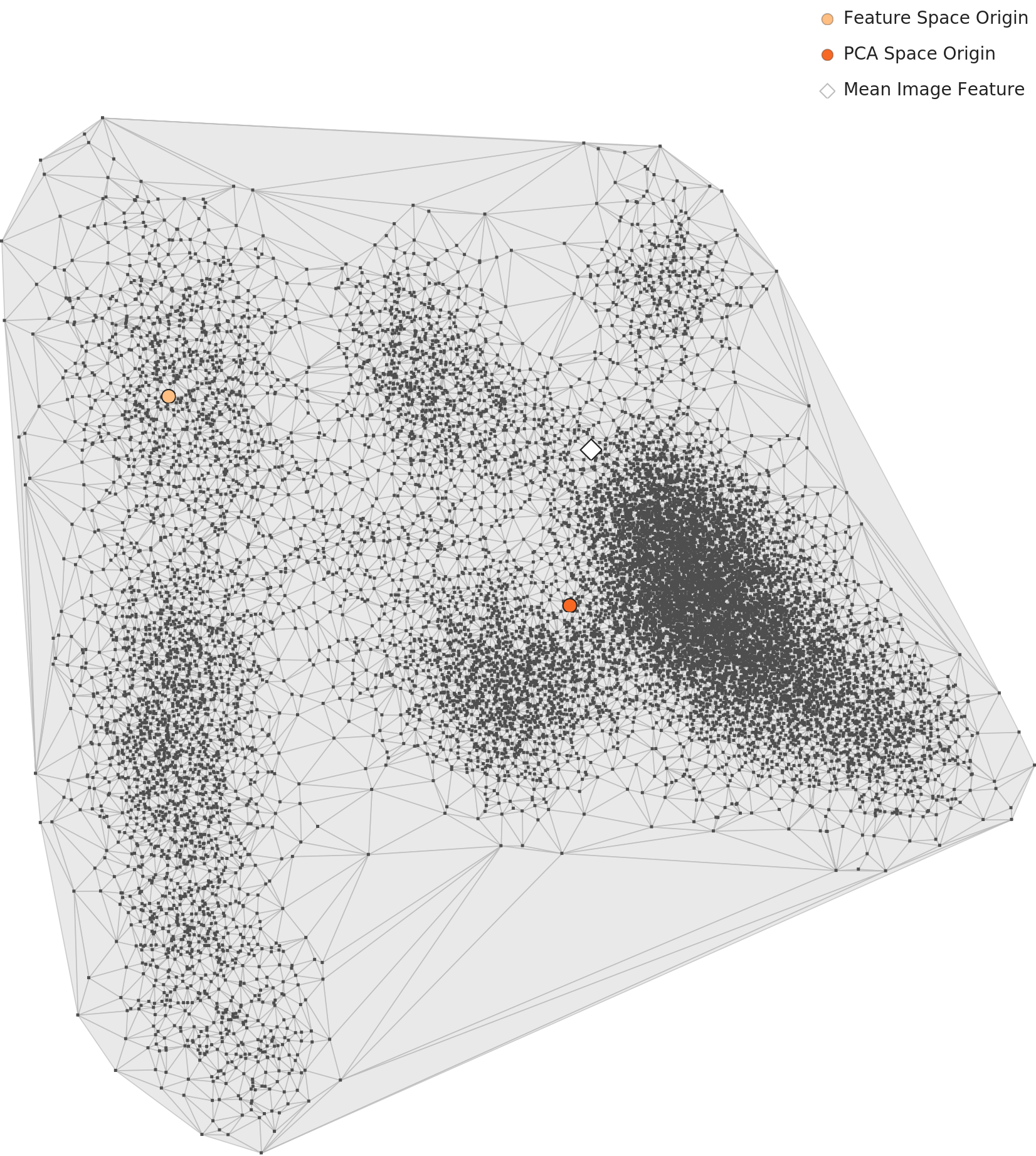
▲ L3 PCA. Points split clearly into a dense core at the lower right and scatter to the left. The points have no class color, but by the density analysis the core reads as smoke and the scatter as fire and some normal (DataClinic analysis).
Place each class's density map beside its representative photo, and you can see where the three classes sit in the 17-dimensional space. Fire is isolated in a small upper-left corner, smoke broadly dominates the center and lower right, and normal settles on the periphery — though some of it spills into smoke's territory.
 Density
Actual
Density
Actual
 Density
Actual
Density
Actual
 Density
Actual
Density
Actual
▲ The left of each card is the L3 density map; the right is that class's representative photo.
And yet, inside this picture of improved separation, two unresolved scenes still hide. One of the normals has crept right up to the edge of the smoke core, and one of the fires has dropped to the lowest density. In the next two sections, we pull each of them out, one image at a time.
The 'Normal' That Looked Most Like Smoke — Seed of False Positives
The photos with the highest L3 density — the "most smoke-like" — ranked first and second were both smoke (9.24 and 9.21). But third place (9.14) carried a normal label: normal_457. It trails the top smoke by only 0.1. A photo classified as normal sits in nearly the same spot as the most typical smoke. We looked directly at what it shows.
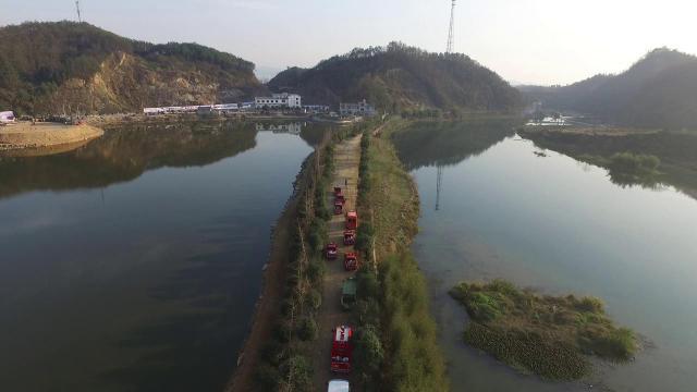
A drone shot looking down on a river under a clear sky. Two channels of water wrap around a central embankment, where red fire trucks stand in a row. No smoke, no flame.
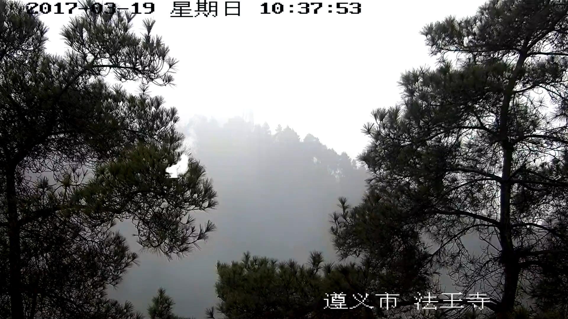
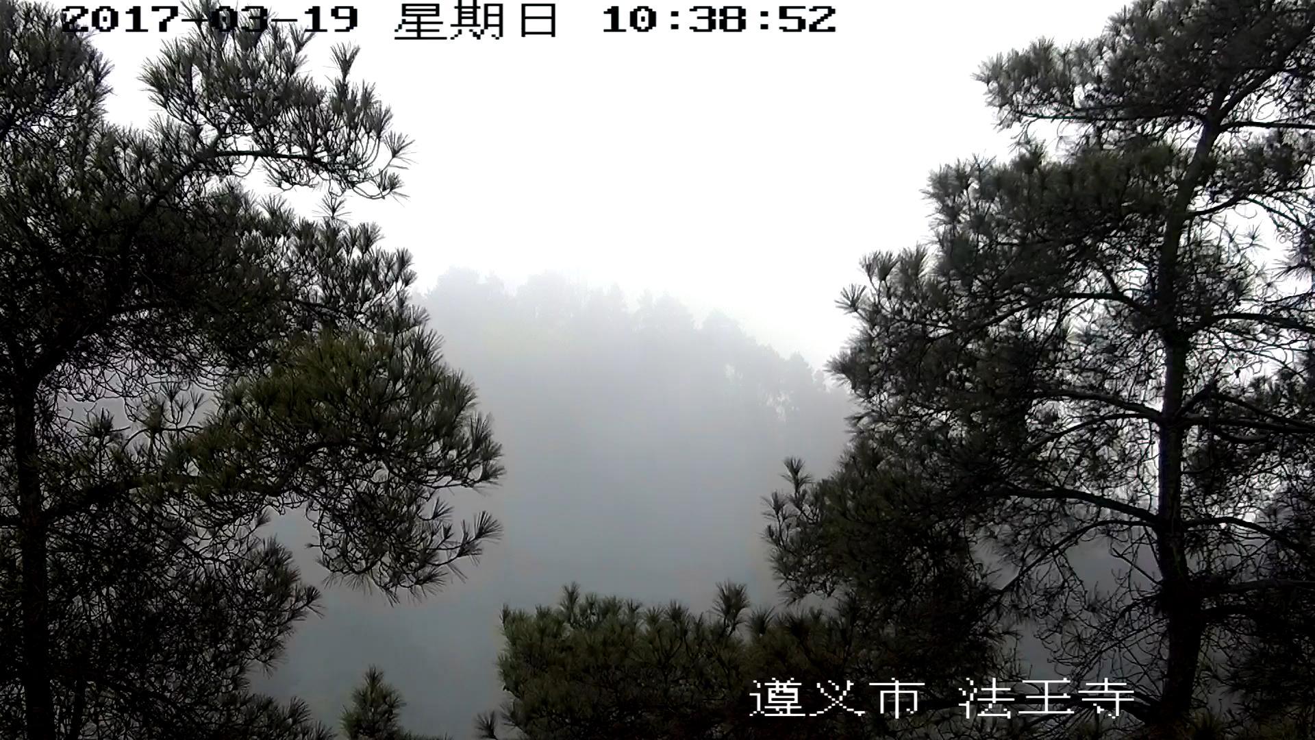
A fog-filled forest surveillance-camera frame (2017-03-19). White haze drifts between pine trees. Hard to tell from early wildfire smoke by eye — its smoke label makes sense.
▲ Nearly identical density (9.14 vs 9.24), yet the left is a clear river and the right a fog-laden forest.
Why did a clear river end up in the same spot as smoke? It's hard to say for certain. Per DataClinic's analysis, the golden, diffuse atmosphere, the bright tones reflected off the water surface, and the composition of the embankment cutting across the frame are presumed to overlap with the feature space of smoke photos. It isn't the gray haze-color itself. A counterexample in the same dataset shows why.
A clear, crisp river. To the eye there's almost no hint of haze, yet its density is among the very highest.
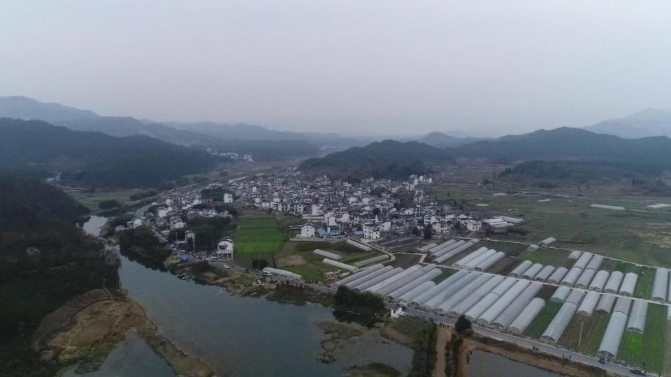
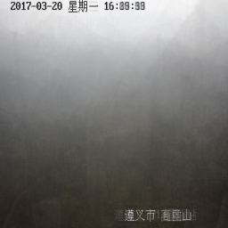
A hazy aerial shot of a rural village under a gray pall. To the eye it looks far more smoke-like than normal_457, yet its density is near the very bottom.
▲ The more fog-like normal_13 receives the lower density. "Smoke-ness" isn't explained by haze-color alone.
Place the two side by side and the conclusion is plain. The signal the model reads as "smoke-like" isn't the simple color of a gray tone — it's deeper features like the texture of a brightly diffusing atmosphere and the spatial composition. normal_457 happened to resemble those deep features; normal_13, similar in color, stayed far from them. The 17-dimensional compression read this subtle difference — and at the same time left normal_457 sitting next to smoke in the end.
The 'Fire' That Looked Least Like Fire — Seed of False Negatives
At the opposite end sits fire. The photo with the lowest L3 density — the one furthest from its own class's type — ranked first (1.68), and it was a fire: fire_392. A typical flame blazes orange across the whole frame, but this photo was the exact opposite.
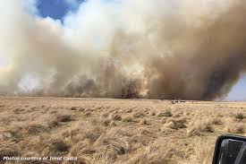
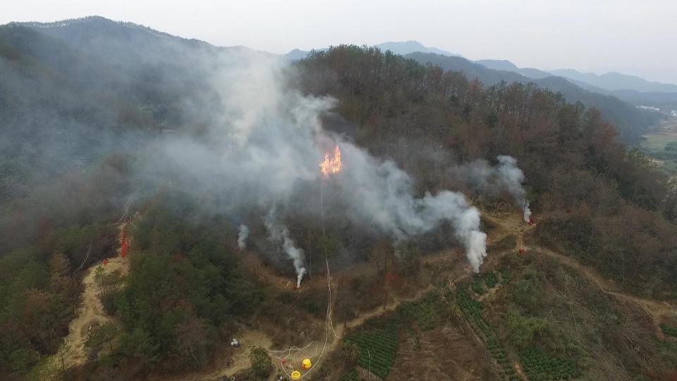
A grassland blaze burning through dry grass. Smoke rising from the horizon covers 70% of the frame horizontally, and the flames are distant and small. A scene dominated by smoke rather than fire.
A close-up of orange flames filling the frame. Exactly the picture you call to mind when the fire class says "fire."
▲ Same fire label, yet the left is closer to smoke and the right is a typical flame.
fire_392 is dangerous because this scene is precisely what an early grass fire looks like. When a fire has just begun to spread, smoke appears first and wider than the flames. Yet in this data, such a scene is treated as an outlier furthest from the fire type. When training data is shaped this way, the model grows accustomed only to "big, roaring flames" and tends to let an early, spreading grass fire slip away as smoke or an ambiguous scene.
The second-lowest-density fire, fire_448, is an outlier of a different grain. It shows a firefighter in a yellow turnout suit fighting a close-up blaze with a hose, and the presence of a person pulls it away from the typical flame close-up (no people). Real fire scenes always include people and equipment, but the data's "fire type" leaves them out.
Two Faces of Wildfire AI — If This Were Live
The two scenes we've seen aren't merely interesting exceptions. They preview how a wildfire AI trained on this data would get things wrong in the field. Two failures, pointing in opposite directions, grow at once from a single dataset.
At dawn, a temperature inversion lays a thin fog over the river and valley. The brightly diffusing atmosphere and the water-surface reflection look like the high-density smoke region.
AI verdict → "Smoke detected, wildfire alert"
Basis image: normal_457 (clear river)
Cost: wasted dispatches and alert fatigue. Frequent false alarms erode trust in the real alerts that matter.
In a dry-season grassland, a fire is just starting at the horizon. Most of the frame is smoke, and the flames are distant and small.
AI verdict → "Smoke or ambiguous, no fire alert issued"
Basis image: fire_392 (grassland blaze)
Cost: lost golden hour. Missing the early fire you most need to catch — the most fatal failure of all.
▲ Both scenarios are grounded in photos that actually exist in the dataset (normal_457, fire_392).
The two failures differ in nature. A false positive chips away at trust; a false negative steals time. And in a safety system, the heavier of the two is usually the false negative. A false alarm ends in annoyance, but a missed fire can't be taken back. And this dataset, of all things, carries the seed of that false negative inside its rarest class — fire (7.2%).
So the prescription isn't "collect more." It's "collect knowing where to fill."
Conclusion — On Diagnosing the Ambiguity of Real-World Data
Forest Fire is not a badly made dataset. The labels are consistent, there are no missing values, and 15,751 images is a respectable scale. But because these are wildfire photos scraped from the real world, they inherit the real world's ambiguity intact. Smoke, fog, and calm scenery blend naturally, and fire always comes with smoke. The 17-dimensional compression pulled apart most of this ambiguity — but the two boundary scenes held out to the end.
Even the same "three classes" carry a different grain depending on where the data comes from. Set it beside the 3-class military synthetic dataset (#225) that Pebblous diagnosed, and the difference is clear.
| Axis | #38 Forest Fire (this story) | #225 Military 3-class |
|---|---|---|
| Classes | fire / smoke / normal | self-propelled gun / truck (covered) / truck (uncovered) |
| Data nature | Real photos · web-collected (Kaggle) | Synthetic · curated |
| Class balance | Severe imbalance (smoke 82.8%) | Balanced by design (equal per class) |
| Boundary ambiguity | smoke↔fog↔normal blur naturally | Per-angle subclusters (controlled by design) |
| Duplicates | Many consecutive frames | Controlled |
Synthetic data lets you design class boundaries, so separation comes out clean. Real wildfire data, on the other hand, can't escape the world's ambiguity. Which means the quality problems of real-world data don't get solved by blindly collecting more. It's faster to first diagnose where the blur is and which scenes sit on the boundary, then fill exactly those spots. Just as DataClinic singled out normal_457 and fire_392, "what to collect next" only comes into focus after you've looked inside the data. This is how Pebblous works with data.
Embedding-level exploration of this dataset can be examined more deeply in the future via the Pebbloscope. For the full diagnosis, see DataClinic Report #38.
References
- 1.Kutlu, K. (2020). Forest Fire. Kaggle.
- 2.Pebblous. (2026). DataClinic Diagnosis Report #38: Forest Fire. Pebblous Inc.