Executive Summary
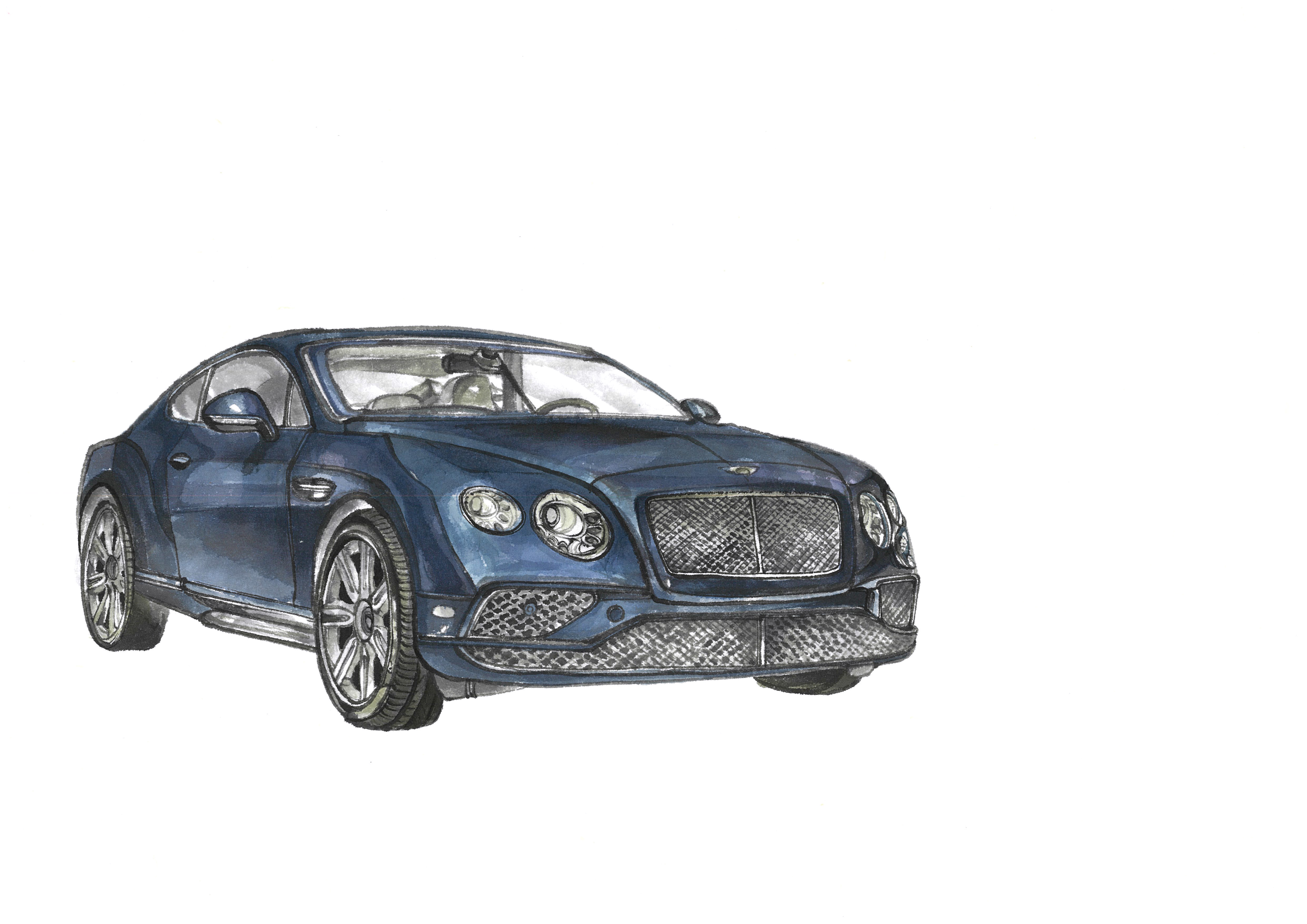
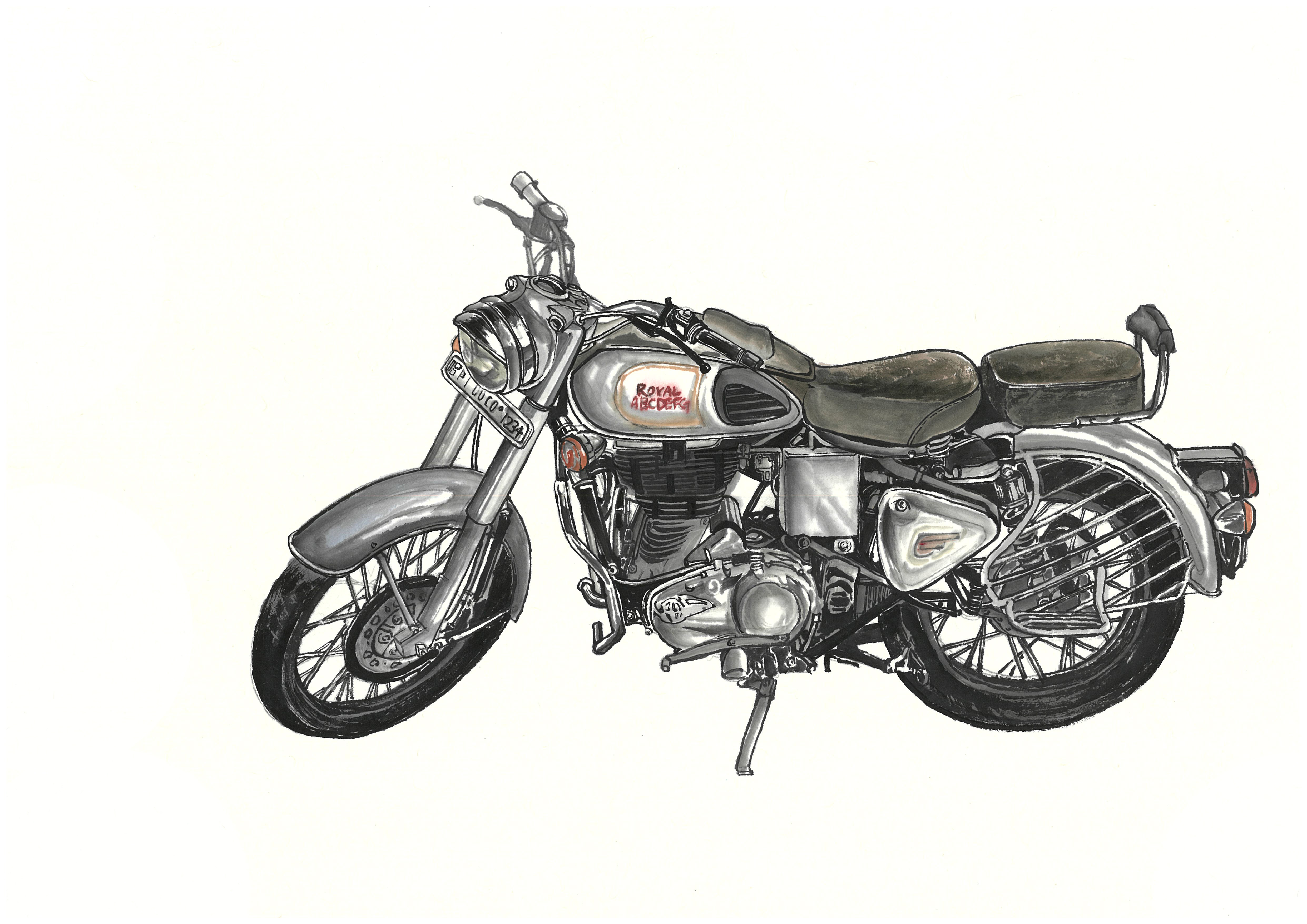
This article is based on the findings of DataClinic Report #194. The "Korean Traditional Ink and Color Painting Production Data" is a public dataset comprising 3,995 images across 74 classes. Open the data, though, and you will find Bentley sedans, tanks, and smartphones sitting right next to tigers and chrysanthemums. Twenty-four of 74 classes (1,651 images) depict modern artifacts — cars, airplanes, blenders — making the word "traditional" ring hollow.
DataClinic's AI lenses capture this contradiction with precision. Both the Wolfram 1,280-dimensional general-purpose lens and the 48-dimensional domain-optimized lens place the bat — a traditional symbol of good fortune (density 0.075) — and the airplane at opposite extremes of the feature space. Two fundamentally different worlds coexist inside a single dataset.
Overall score: 57 out of 100 (Poor). The painting technique is consistent — watercolor and ink throughout — but the subjects range from Joseon-era landscapes to 21st-century luxury cars. The problem is not the number of images; it is that the domain definition itself is broken.
DataClinic Grade Summary
Dataset Overview — Under the Banner of "Traditional Ink Painting"
The "Korean Traditional Ink and Color Painting Production Data" is a public dataset released through AI Hub. It was built to digitize paintings created with traditional Korean techniques — ink, brush, and watercolor pigments — and make them available for AI training. The dataset permits commercial use and can be diagnosed on DataClinic as Report #194.
▲ 3,995 "Korean Traditional Ink Paintings" — Bentleys and tanks nestled among tigers and chrysanthemums (DataClinic L1 collage)
The gap between expectation and reality hits you the moment you open the collage. Familiar traditional subjects are all present — landscape paintings, tigers, carp, chrysanthemums. But right next to them sit luxury sedans, fighter jets, and smartphones. Every image follows the same composition: a single subject centered on a white background. The technique is unified — watercolor and ink strokes throughout — but the subjects ignore centuries of history.
Dataset Specifications
- • 3,995 images
- • 74 classes
- • High resolution: 3,040×2,150 to 9,930×7,020 px
- • Consistent RGB channels
- • Average 48 images per class (std. dev. 17)
- • Commercial use permitted
Class Composition
- • 50 natural subjects (animals, plants, landscapes, people)
- • 24 artifacts (vehicles, appliances, furniture, buildings)
- • Natural average: 46.9 images/class
- • Artifact average: 68.8 images/class
- • Largest class: House — 85 images
- • Smallest class: Bear — 27 images
Is This Really Traditional Painting?
Hear the words "traditional Korean ink painting" and certain images come to mind. The tiger as mountain guardian, the carp leaping through the Dragon Gate, the chrysanthemum representing the recluse among the Four Gentlemen, and the pine tree embodying integrity. These traditional subjects — called hwaje (畫題) — have anchored Korean painting for centuries.
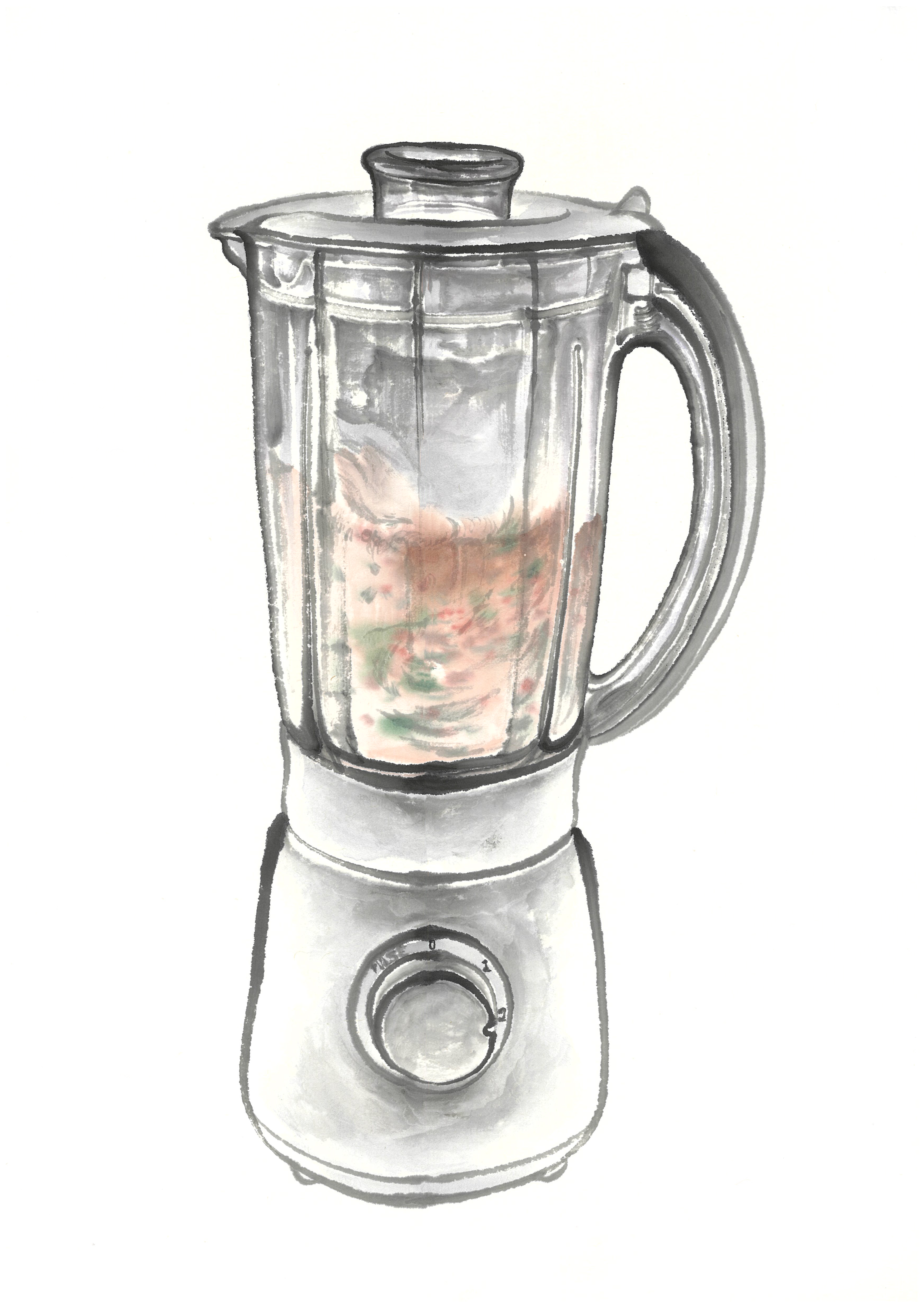
But open this dataset and those traditional subjects share shelf space with cars (79 images), motorcycles (78), phones (75), airplanes (72), tanks (66), and blenders (57). Below, we place six traditional subjects side by side with six modern objects. In each card, the left image is an actual sample and the right is the class mean image.
Traditional Subjects — The Heart of Korean Painting
 Actual
 Mean
Mean
 Actual
 Mean
Mean
 Actual
 Mean
Mean
 Actual
 Mean
Mean
 Actual
 Mean
Mean
/2_13_49_0026.jpg) Actual
Actual
.png) Mean
Mean
▲ Six traditional subjects — averaging 37.7 images/class. Left: actual sample / Right: mean image
Modern Objects — The 21st Century Enters "Traditional Painting"
 Actual
 Mean
Mean
 Actual
 Mean
Mean
/1_6_23_0010.jpg) Actual
Actual
.png) Mean
Mean
/1_2_7_0052.jpg) Actual
Actual
.png) Mean
Mean
 Actual
 Mean
Mean
 Actual
 Mean
Mean
▲ Six modern objects — averaging 69.5 images/class, nearly twice the traditional count
Key finding: In a "traditional painting" dataset, the traditional subjects are actually the minority. The 24 modern artifact classes average 68.8 images each, while the 50 natural subject classes average only 46.9. The dataset borrows the name of tradition, but its center of gravity tilts toward modernity.
Level I — Tidy on the Surface
Level I examines the basic physical properties of images. There are no missing values and channels are consistently RGB. The trouble, however, shows up in image dimensions.
Image Size Consistency: Poor
Resolutions range from 3,040×2,150 px to 9,930×7,020 px — a 3.3× size ratio that far exceeds DataClinic's 1.5× threshold. Since every image is a high-resolution scan (at least ~6.5 megapixels), downsampling to a common size is straightforward, but as-is, a resizing step is mandatory before model training.
What the Overall Mean Image Tells Us
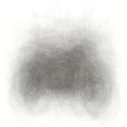
Stack all 3,995 images on top of one another and what do you get? The global mean image is a pale grayish-beige field with a blurry brown mass at center. No structure, no texture, no identifiable form.

▲ Mean of all 3,995 images — confirms every painting shares the same "subject centered on white background" composition
This confirms that every image follows an identical compositional template: a single subject centered on a white background. That is an illustration convention, not the aesthetic of traditional ink painting with its deliberate negative space and compositional asymmetry. When DataClinic flags "low diversity," it means pixel-level visual diversity. Semantically there are 74 different subject types, but the visual patterns AI perceives are remarkably uniform.
Class balance: An imbalance ratio of 3.15 (max 85 / min 27) rates as "Fair." But a hidden pattern lurks behind that number: artifact classes (average 68.8 images) systematically outnumber natural subject classes (average 46.9). The irony: modern artifacts are more robustly represented in a "traditional painting" dataset.
Level II — 74 Worlds Through the Wolfram Lens
Level II observes images through the 1,280-dimensional general-purpose lens of Wolfram ImageIdentify Net V2. Instead of raw pixels, it diagnoses the geometric structure and density distribution of data in a high-dimensional feature space.
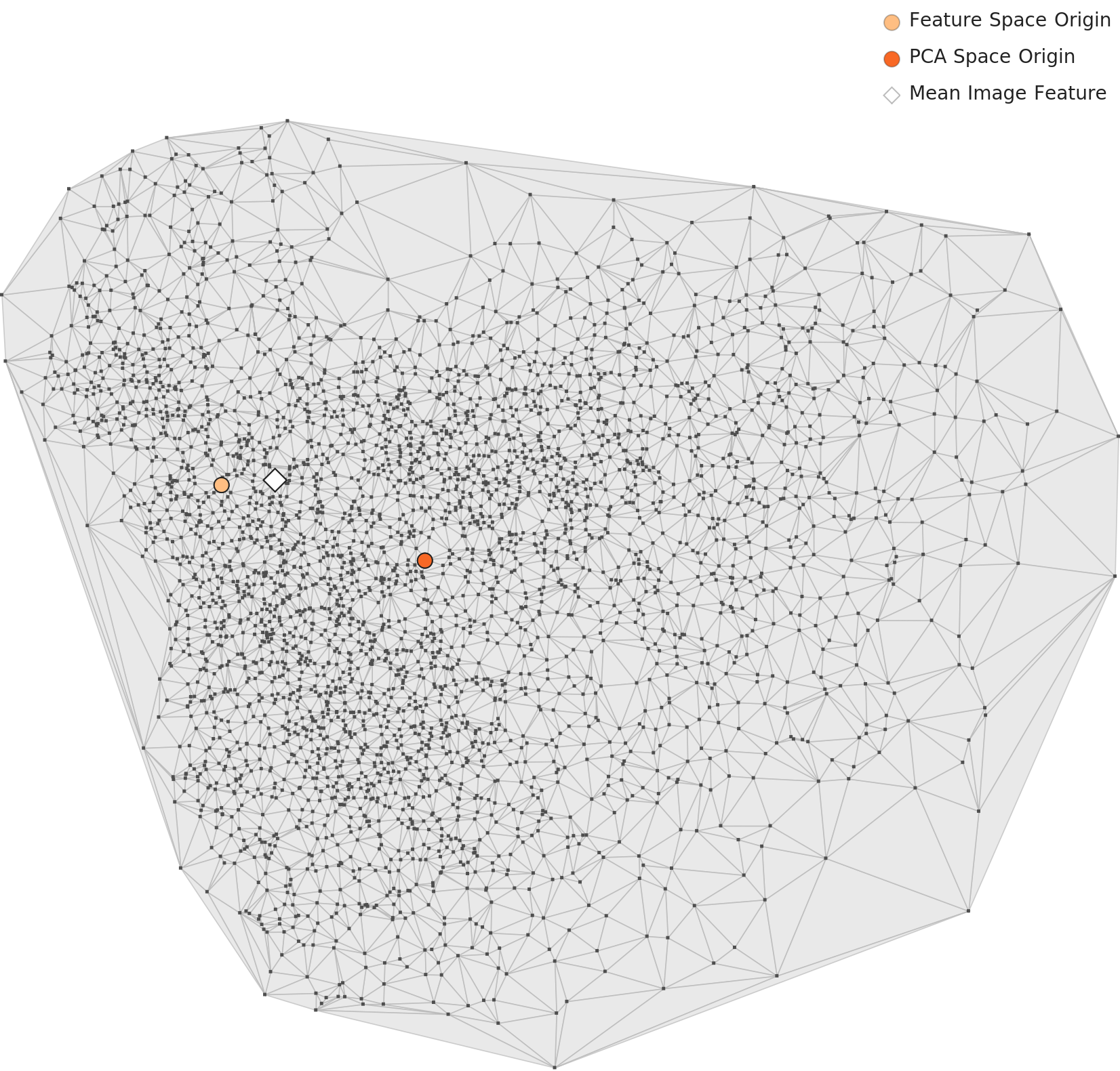
PCA — One Cluster, Internal Density Gradient
The PCA chart projecting 1,280 dimensions down to two shows all 3,995 images forming a single large cluster. It is slightly elongated and lean. No clearly separated sub-clusters appear, but density varies across the interior: the center-left region is dense, while points thin out toward the periphery.
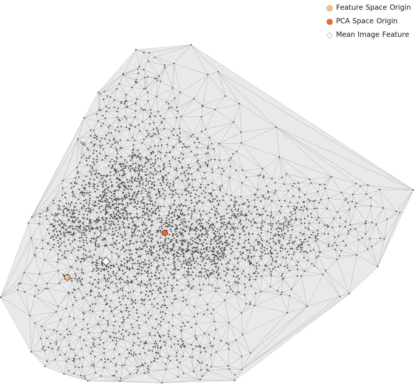
▲ L2 PCA — a single cluster with density gradient. Orange dot: feature-space origin. Red dot: PCA-space origin.
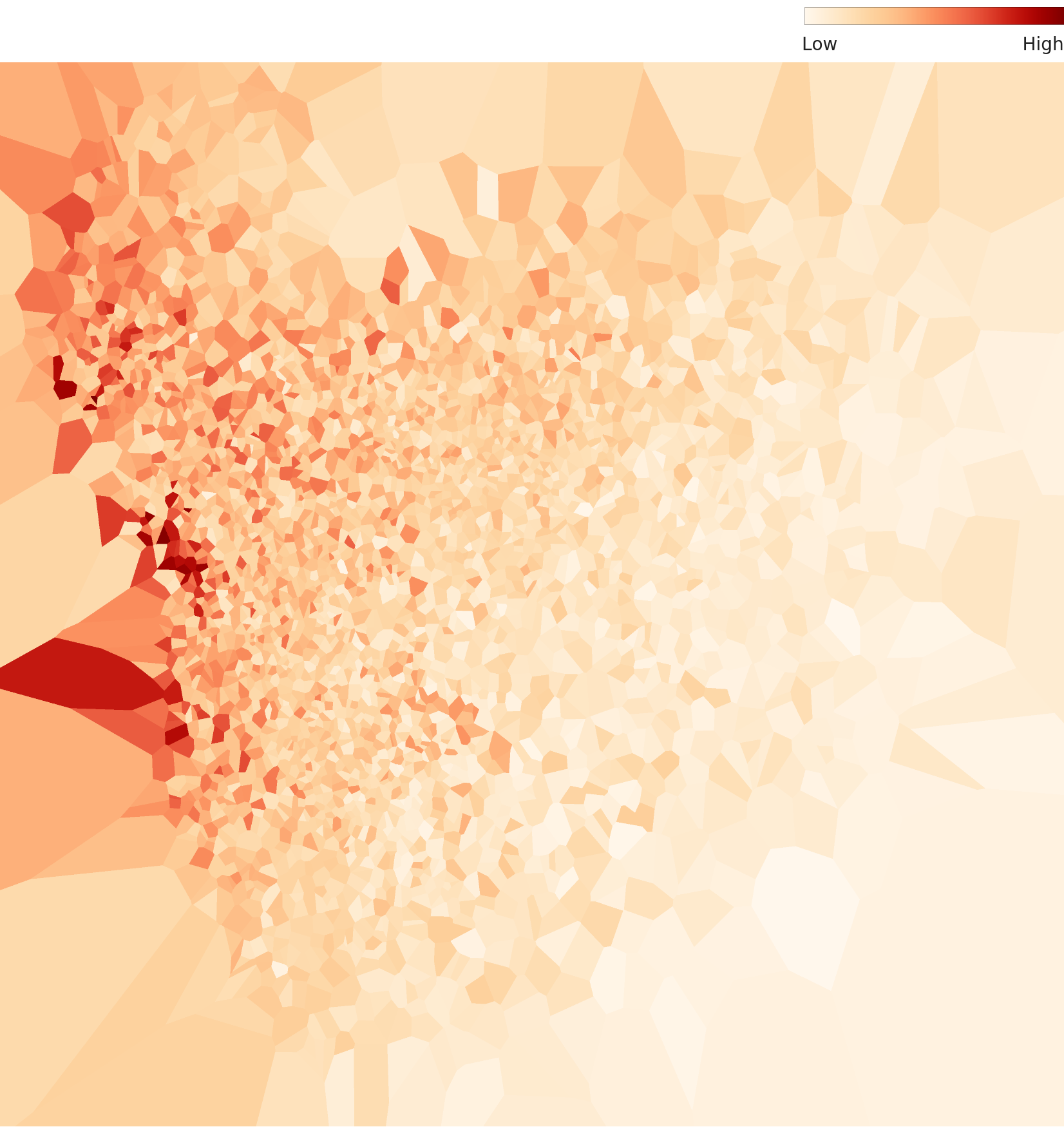
Density Heatmap — API Claims vs. Visual Reality
The DataClinic API describes this distribution as "bell-shaped around the origin and data center." The actual density heatmap tells a different story: the distribution is asymmetrically concentrated in one corner. The high-density core (deep red) occupies a limited area, while the rest of the space spreads out at low density. "Asymmetric concentration" is a more accurate description than "bell-shaped."
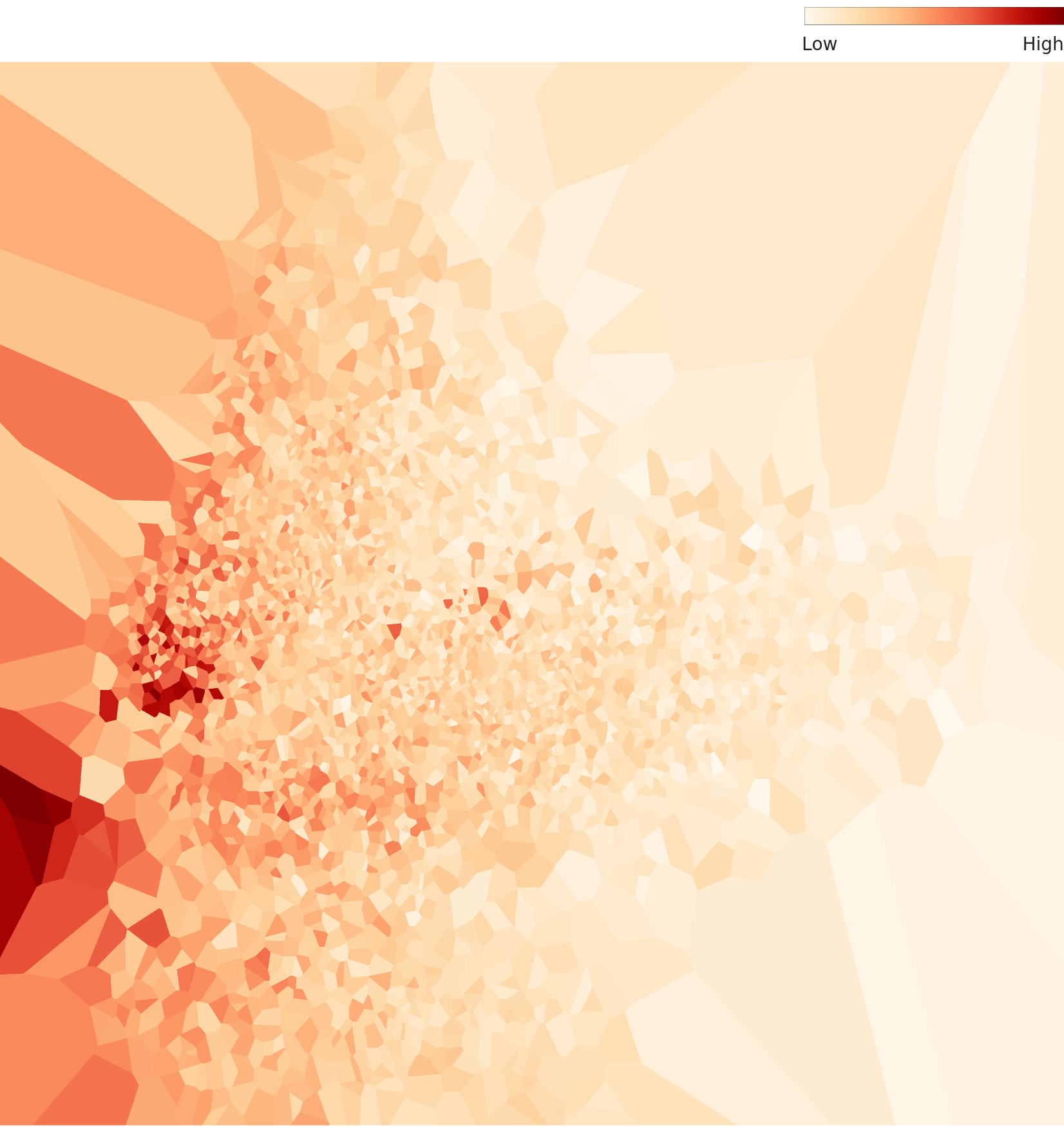
▲ L2 density heatmap — asymmetrically concentrated distribution, diverging from the API's "bell-shaped" description.
Per-Class Density — High vs. Low
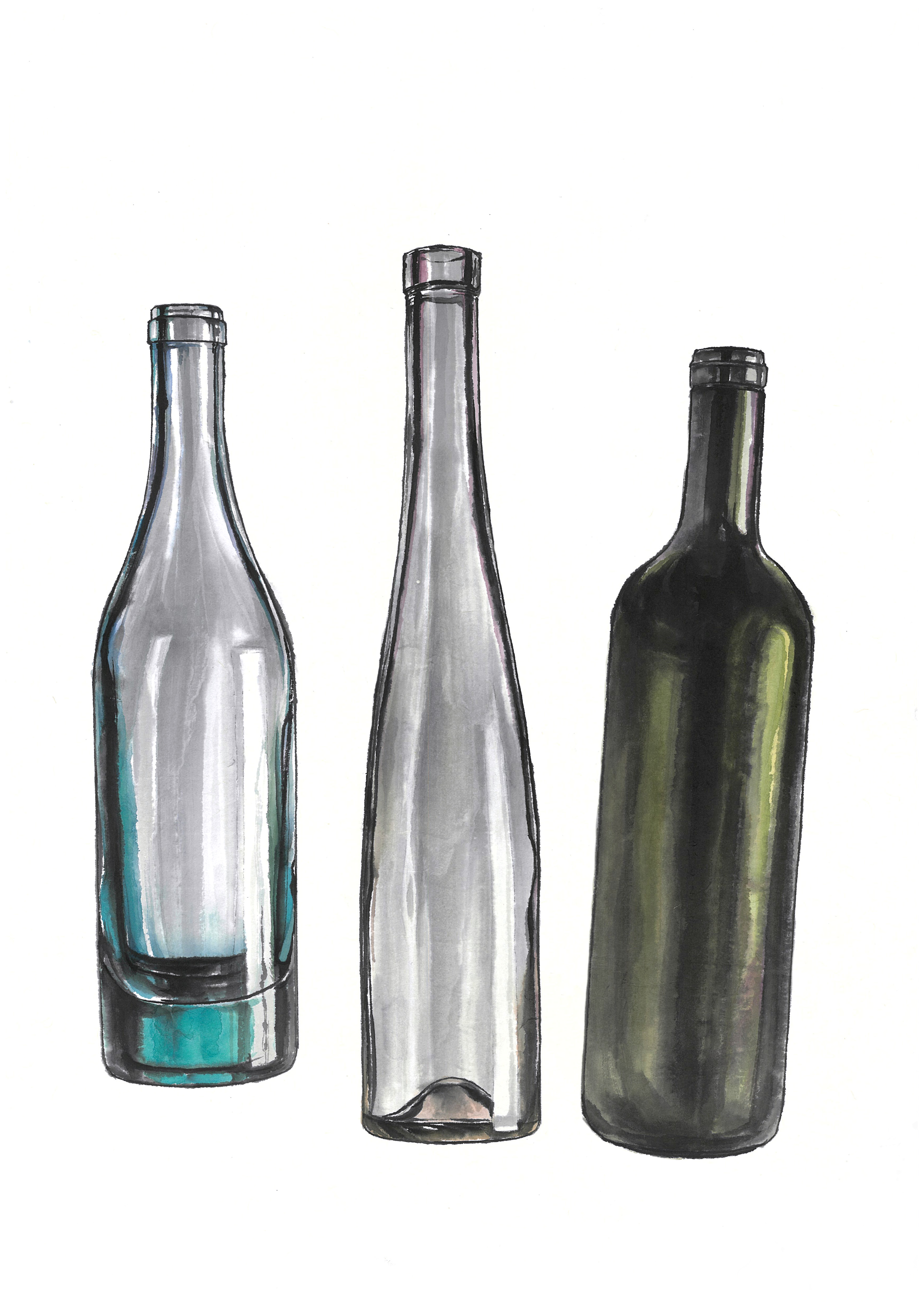
Zoom into individual classes through the Wolfram lens and a clear pattern emerges: simple, symmetrical objects (bowls, bottles) cluster tightly at high density, while irregular organisms (bats, octopuses, rays) scatter widely at low density.
.png) Density
Density
/1_1_3_0071.jpg) Actual
Actual
 Density
 Actual
 Density
 Actual
 Density
 Actual
▲ Each card — Left: L2 density chart / Right: representative sample (actual image)
Nearest & Farthest Neighbors — Two Worlds in One Dataset
DataClinic's similarity analysis identifies the nearest and farthest neighbors in feature space. Nearest neighbors cluster by visual shape: bat-dinosaur-butterfly-ray share dark silhouettes, while otter-hamster-rabbit bond over similar small-mammal body plans.
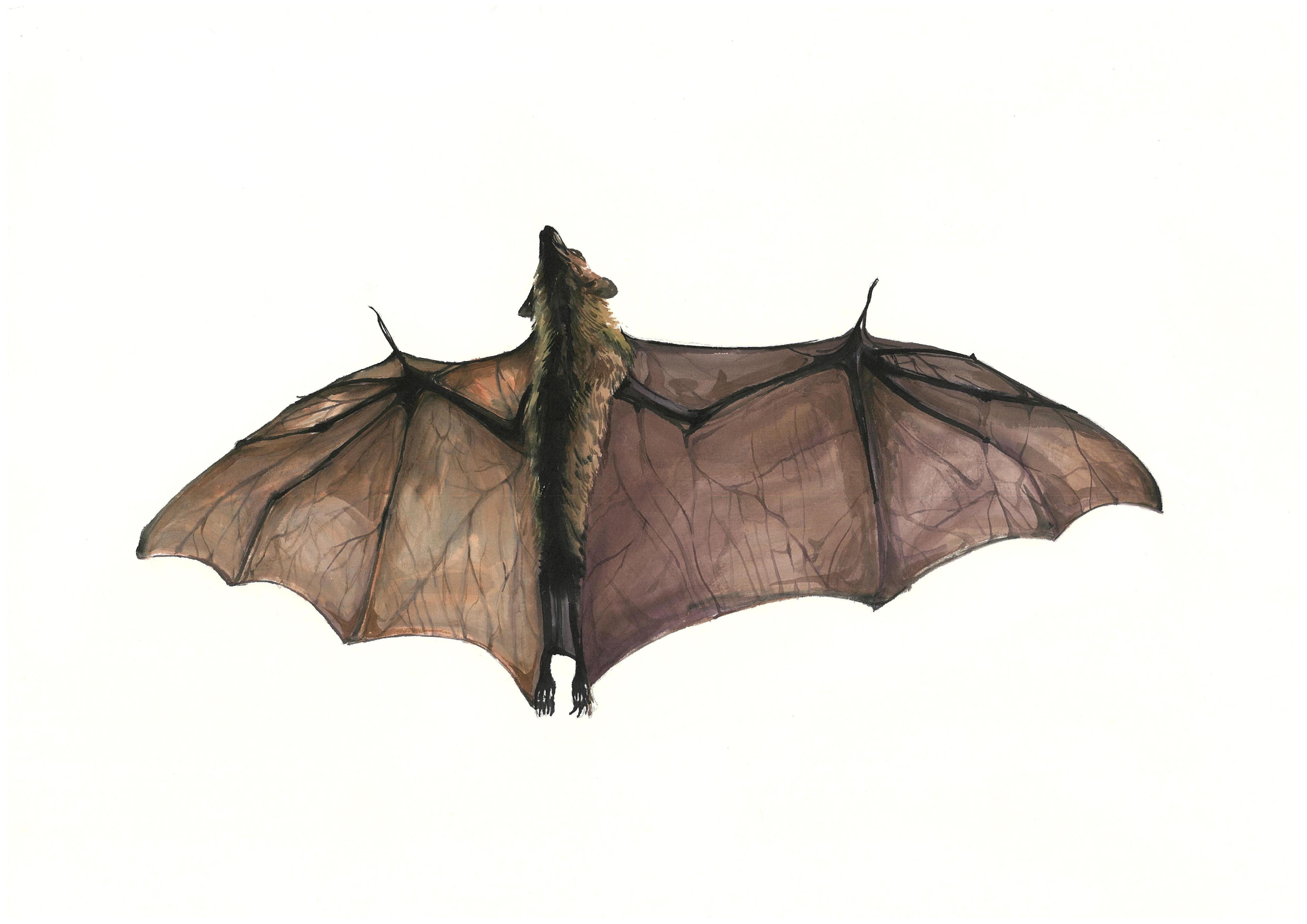
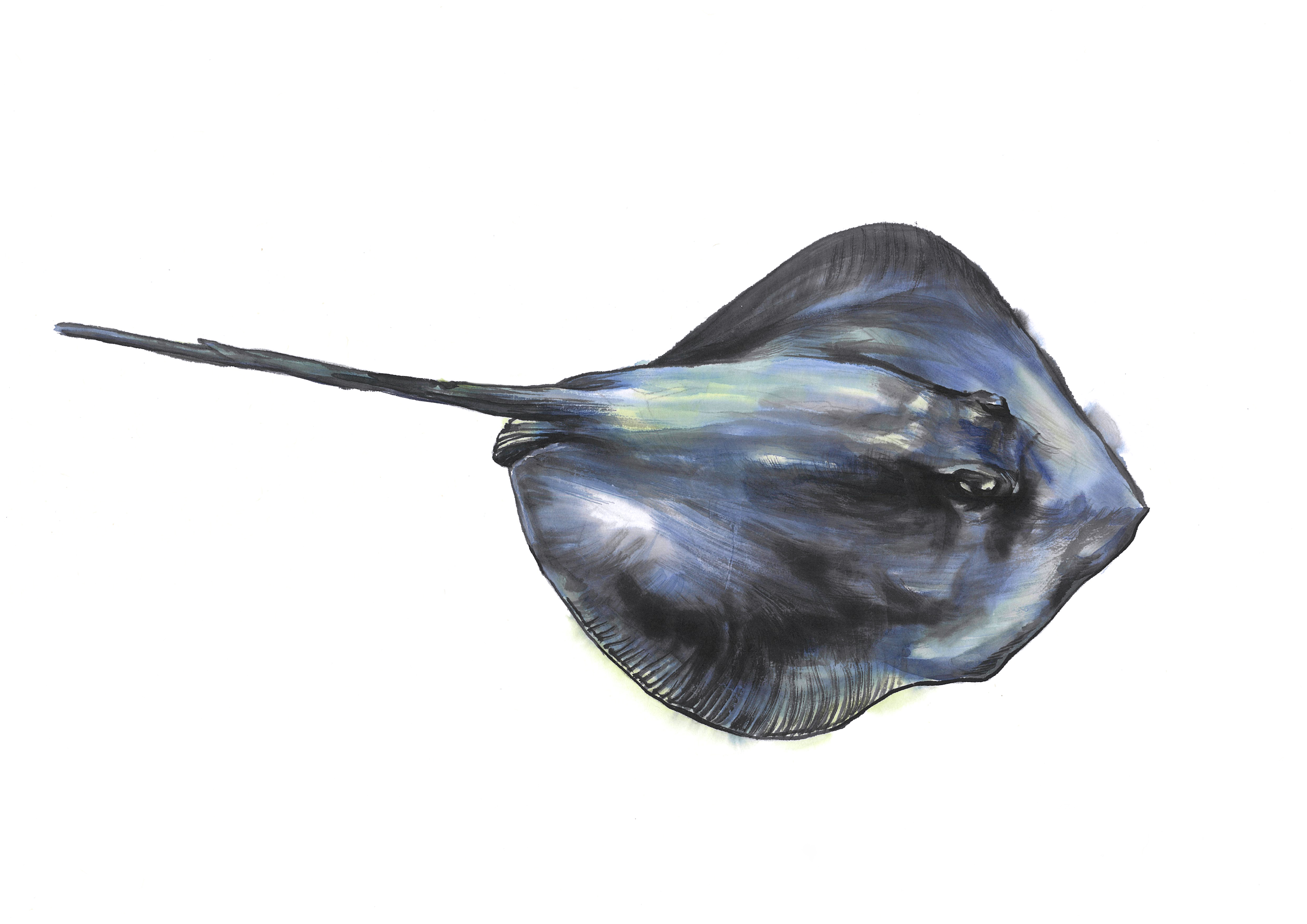
The farthest pair, however, exposes the dataset's fundamental contradiction. The two classes most distant in feature space are bat and airplane.
Density 0.075
Modern vehicle
▲ The two most distant classes in feature space: the traditional good-fortune bat and the modern airplane. Two fundamentally different worlds coexist in a single dataset.
The irony: In Chinese characters shared by Korean, the bat (蝹蝠) is a homophone for "fortune" (福), making it one of the most iconic auspicious motifs in traditional East Asian painting. Yet in this "traditional painting" dataset, that very symbol of tradition is the class AI understands least (density 0.075), and it sits at the maximum feature-space distance from the most modern subject — the airplane. The heart of tradition turns out to be AI's blind spot.
Level III — The 48-Dimensional Lens Sharpens the Picture
Level III applies an optimized 48-dimensional lens extracted from a 265-layer neural network trained on 3 million images. Its purpose is to reveal domain-specific structures that the general-purpose 1,280-dimensional lens misses.
PCA — More Compact, but Internal Structure Stands Out
The PCA chart through the 48-dimensional lens shows a more compact, rounder distribution than L2. The optimized lens pulls data points closer together. Yet within that tighter form, density variation is actually more pronounced. Broad groupings — artifacts vs. natural subjects, large animals vs. small objects — emerge as distinct sub-groups.
▲ L3 PCA — more compact than L2, but internal density variation is more pronounced.
Density Heatmap — Bimodal Structure Appears
The L3 density heatmap reveals a bimodal structure invisible in L2. One high-density concentration sits in one region, and a second density nucleus appears at a distance. The 48-dimensional lens is beginning to separate the two lineages within the data — likely the artifact family and the natural-subject family.
▲ L3 density heatmap — bimodal structure more pronounced than L2. Correlation 0.999 between L2 and L3, showing two resolutions of the same phenomenon.
Three Density Zones
Combining L2 and L3 analysis, the 74 classes fall into three density zones.
Bowls, bottles, hamsters, babies — simple, symmetrical forms. The classes AI recognizes with greatest confidence.
Cats, dogs, cars, furniture — subjects with moderate pose variation.
Bats, octopuses, rays, dinosaurs — irregular body plans with extreme pose variation. AI's blind spots.
L2 vs. L3: The two lenses correlate at 0.999, observing essentially the same phenomenon. The difference is resolution. Where L2 (1,280 dimensions) lumps everything into one broad cluster, L3 (48 dimensions) resolves the separation of artifact and natural-subject density nuclei within it. The optimized 48-dimensional lens cuts more sharply into the domain-alignment problem.
WikiArt Comparison — Same Domain, Opposite Failures
No discussion of art datasets is complete without WikiArt. Diagnosed as DataClinic Report #115, WikiArt contains 81,471 Western art images classified into 27 styles (Impressionism, Baroque, etc.). Overall score: 53 (Poor) — close to the 57 of the Korean ink painting dataset. Both score "Poor" in the art domain, but the reasons are polar opposites.
| Attribute | WikiArt #115 | Korean Ink Painting #194 |
|---|---|---|
| Score | 53 (Poor) | 57 (Poor) |
| Images | 81,471 | 3,995 |
| Classes | 27 (styles) | 74 (subjects) |
| Classification basis | Art style (Impressionism, etc.) | Subject matter (tiger, car, etc.) |
| Core problem | Blurry boundaries between styles | Traditional/modern subjects mixed |
| Domain alignment | High (actual artworks) | Low (many modern objects included) |
| Nature of failure | AI struggles to understand art | Humans mis-defined the dataset |
WikiArt's difficulty is inherent. Even art historians debate where Monet ends and Renoir begins. Classifying artistic style is an intrinsically hard task for AI — a feature of the domain, not a flaw of the dataset.
Dataset #194's problem is structural. Telling a tiger from a car is trivial — no AI confuses the two. The question is: "Why are they in the same dataset?" Painting a tank in ink-wash technique does not make it traditional Korean art.
Lesson from two art datasets: Western art (WikiArt) fails because of inherent boundary ambiguity; Korean traditional art (#194) fails because of an identity crisis. Data quality is not about image count — it is about what you put in. Whether 81,471 images or 3,995, a shaky domain definition means a shaky score.
So What — What Happens When You Train AI on This Data
A data quality diagnosis does not end at the numbers. The real question is: "What goes wrong when you actually build an AI system with this dataset?" Answering that completes the diagnosis.
Cultural Heritage Classifier Goes Haywire
Imagine a national museum building an automatic classification system for its painting collection. An AI trained on this dataset as "Korean Traditional Ink Painting" would label watercolor illustrations of Bentleys, tanks, and smartphones as "traditional Korean art." Actual Joseon-era landscape paintings would sit in the same category as modern car illustrations.
Traditional Style Generator Produces Absurdities
Prompt a generative AI trained on this data to "paint in traditional Korean ink style." The result could feature motorcycles and blenders appearing among tigers and pine trees — because the "traditional" label extends to modern objects in the training data.
Credibility of Cultural Data Exports at Stake
When this dataset is shared internationally as "Korean traditional art data," researchers who discover tanks and airplanes inside will question the credibility of Korean cultural datasets as a whole. One dataset's domain-definition error can erode trust in an entire nation's cultural data infrastructure.
What Density Tells Us About Misclassification Risk
The density analysis yields its most paradoxical finding when we compare these two classes.
The Chinese character for bat (蝹蝠) sounds like "fortune" (福) — making it a premier symbol of luck and blessing in traditional painting. Yet AI is least certain about this class.
A modern still-life subject, not a core traditional motif — yet the class AI recognizes with greatest confidence.
In a "traditional painting" dataset, what AI knows best is the bowl, and what it knows least is the bat — the very symbol of fortune. The heart of tradition becomes AI's blind spot. That is the structural distortion a domain-definition error creates.
Prescription — DataClinic's Recommendations and Beyond
DataClinic recommends Data Bulk-up for this dataset. Class-level sample counts are imbalanced and overall density is low, so more images are needed. A fair point — but the fundamental problem runs deeper.
Priority 1: Domain Curation
The most urgent step is not adding images but reorganizing the ones already there. Two paths forward:
- A. Separate modern objects: Move cars, airplanes, tanks, smartphones, and other non-traditional subjects into a separate dataset. Reconstruct a pure traditional painting dataset from the remaining natural subjects and traditional architecture.
- B. Rename the dataset: Change "Korean Traditional Ink and Color Painting" to something like "Multi-Subject Ink/Watercolor Technique Dataset." The technique is consistent, so a technique-centered name is more accurate.
Priority 2: Bolster Traditional Subject Classes
Increase sample counts for under-represented traditional subjects — bear (27), carp (32), ray (28) — to 70+ images each, matching the artifact-class average of 68.8.
Priority 3: Pose Control for Low-Density Classes
For sparse classes like bat (0.075), octopus (0.075), and ray (0.079), new images should maintain some consistency in pose and composition to tighten the cluster. Add volume, but within controlled variation so that density improves.
Priority 4: Standardize Image Dimensions
The 3.3× size ratio must be resolved. Since all images are high-resolution scans, downsampling to a common resolution (e.g., 4,000×3,000 px) is practical.
Bottom line: DataClinic's "Data Bulk-up" prescription addresses quantity. But this dataset's root problem is not quantity — it is domain definition. Painting a Bentley in ink-wash technique does not make it traditional Korean art. Before adding more images, you must first redefine what the dataset is.