Executive Summary
For the past few years, Earth-system foundation models have grown up on physical data alone — weather, ocean, cryosphere. ClimaX and ECMWF's AIFS are emblematic of that path. Left out of training was the one presence that both alters the environment and reacts to its changes: people. In July 2026, a team from Politecnico di Milano and CMCC posted WorldTensor to arXiv, a dataset built to fill that gap. It aligns 757 variables — emissions, land use, infrastructure, disasters, socioeconomic indicators — onto a single 0.25° grid, placing the people who move the planet onto the same coordinates as physical data for the first time.
The point is not scale but alignment. Climate reanalysis arrives on dense grids, while population, GDP, power plants, and conflict statistics are scattered as points, administrative boundaries, and sparse yearly snapshots. Resolution, projection, and temporal cadence all differ, so no matter how much data there is, it cannot be fed into one model as-is. What WorldTensor did was not the cleaning that fixes errors, but the work of reconciling sources that could not speak to one another onto a single common coordinate system.
Even for someone who never touches climate science, this case leaves behind a question familiar to anyone who works with data: the real difficulty of AI-Ready Data is not the cleaning that fills in missing values, but giving heterogeneous sources a common language. And who defines that common language — with which grid — decides how a model gets to see the world.
757 variables
aligned on one grid
climate, emissions, land use, disasters, socioeconomics on shared coordinates
1.03M cells
0.25° grid
Earth's surface split into 720×1,440 = 1,036,800 cells
22 human variables
in the same cells
population, GDP, HDI, night lights, urban area, conflict aligned for the first time
annual limit
short signals fade
captures El Niño and conflict, but COVID-style shocks blur
What Earth-Learning AI Never Saw
Earth-system foundation models have multiplied quickly in the last few years. ClimaX emulates climate and weather; ECMWF's AIFS forecasts weather at daily resolution. They share one trait: all were trained on physical variables alone — temperature, precipitation, ocean currents, sea ice. In effect, they saw the planet only as a collection of physical phenomena.
This gap did not arise from a lack of interest. It is a structural problem, born from the fact that the data come in fundamentally different shapes. Climate reanalysis arrives on grids that blanket the whole planet at hourly or daily resolution. Population, GDP, disaster, and infrastructure statistics, by contrast, are scattered not as grids but as points (power-plant coordinates), vectors (administrative boundaries), and sparse snapshots taken once every few years. Physical data and human data record the same planet, yet they are written in different languages.
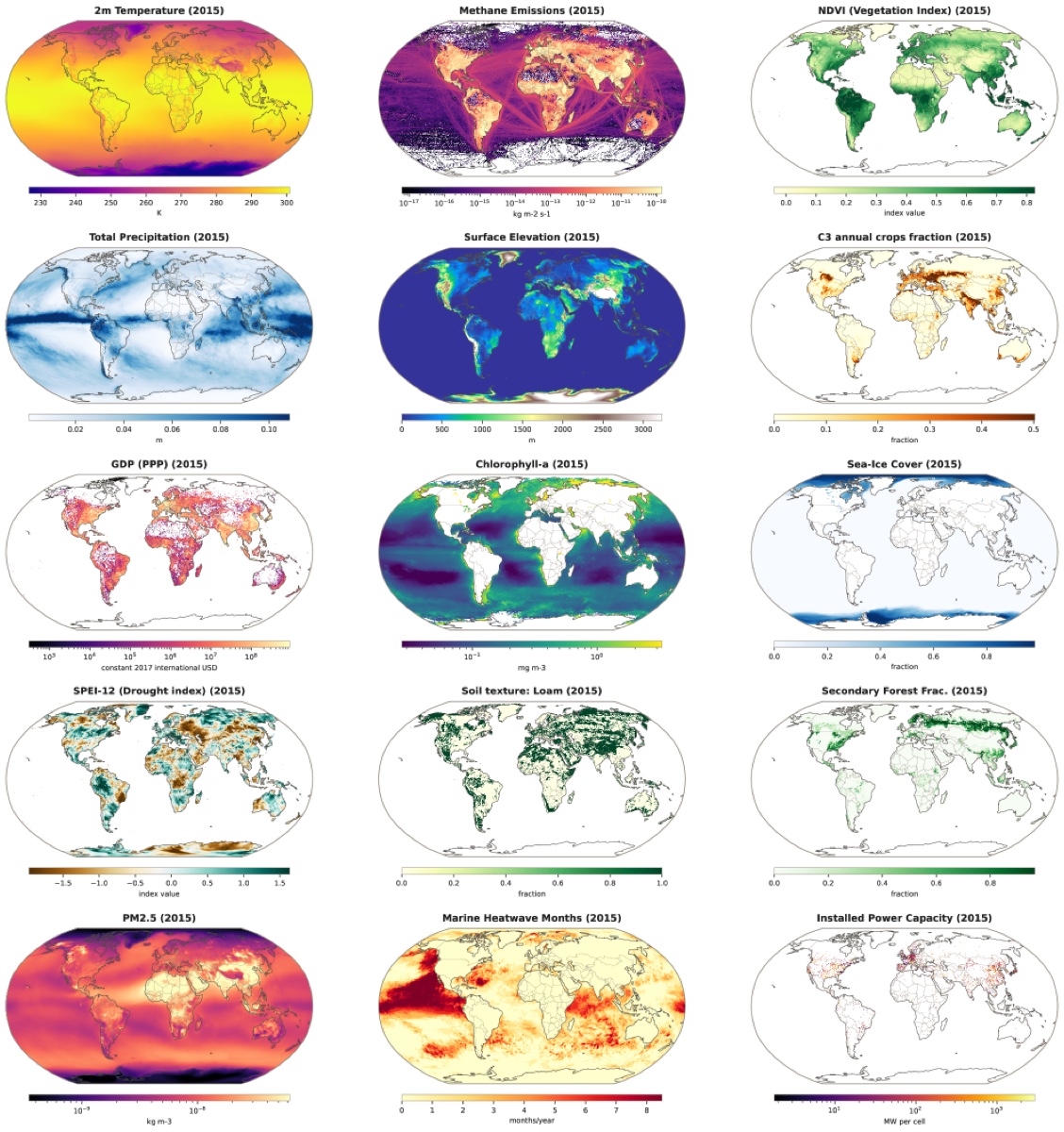
The WorldTensor team's motivation starts here. Human systems both drive environmental change and respond to it, yet there was no resource to place the two on the same coordinate system and learn them together. For a single model to see the loop — emissions pushing climate, climate in turn pushing migration and conflict — emissions, climate, and conflict must first live inside the same cell.
Core observation: Earth-system AI failed to see people not because the data were missing, but because people's data were scattered in a different shape from physical data. What blocked integration was not quantity but the coordinate system.
Reconciling Scattered Data onto One Grid
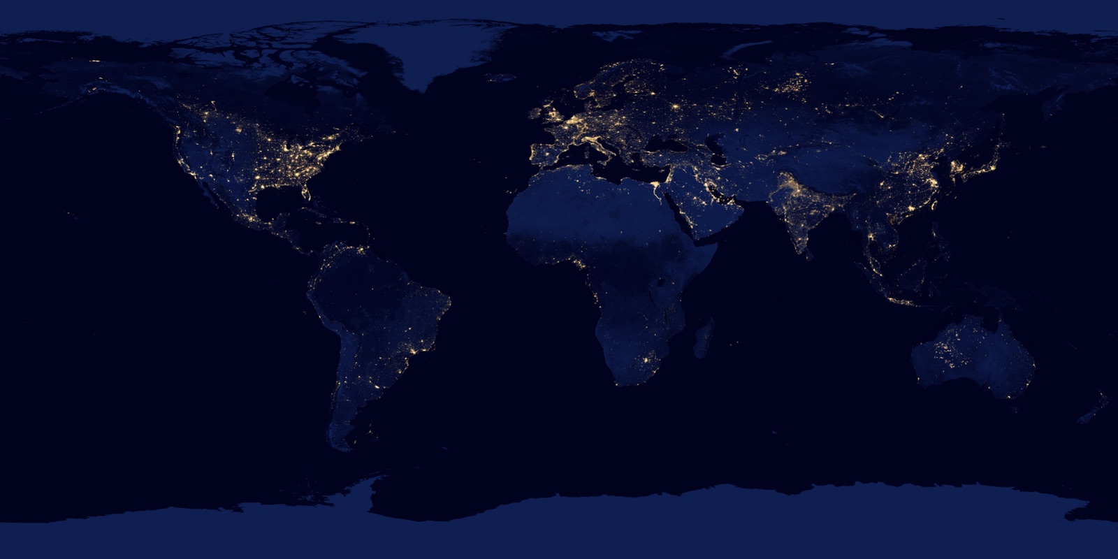
WorldTensor places 757 variable series onto a single regular 0.25° grid — 658 time-varying variables plus 99 static layers such as terrain and soil. The grid cuts latitude and longitude at 0.25° intervals, dividing Earth's surface into 720×1,440, or 1,036,800 cells. Climate (ERA5) 276, land use (LUH3) 112, static terrain and soil 99, emissions (EDGAR, CEDS, ODIAC) 67, energy 52, air quality 40, disasters and conflict 28, and a human-system set of 22 holding population density, GDP, HDI, night lights, and urban area — all meet on this one grid.
The team calls this work harmonisation, not cleaning. It is not filling in missing values or fixing errors, but forcibly fitting data scattered across different resolutions, projections, and temporal cadences into one common coordinate system. The method splits into three tracks depending on the shape of the source.
2.1Three Alignment Techniques
- Spatial harmonisation — continuously varying fields like temperature are fitted to the grid with bilinear resampling; categorical values like land cover use nearest-neighbour assignment. Where the source is finer than the grid, area-weighted averaging presses it down.
- Rasterisation — point data like power plants or earthquakes are placed directly in the relevant cell and also converted into a separate field holding the distance to the nearest event. Line and area data such as administrative regions are estimated as density in a metric coordinate system.
- Temporal harmonisation — years without data are left blank rather than filled arbitrarily. The principle is to reflect the source's actual availability honestly instead of inventing values that do not exist.
The result is 46 GB across 52,823 NetCDF files, spanning 1900 to 2025. The data are released in full under CC BY 4.0, and the pipeline code under MIT. Coverage windows differ by domain — climate starts in 1940, air quality in 2003 — but all are aggregated to annual statistics and laid onto the same time axis.
Evidence the Merge Holds
How do we know that data forced into alignment like this is actually usable, not merely formatted to match? Rather than training a foundation model to show off its performance, the team validated whether the data itself can be trusted along five tracks — an honest positioning of the work as research infrastructure.
The most convincing is whether temporal signals actually survive. The El Niño events of 1997–98 and 2015–16 were detected statistically, and the 2012–15 Syrian civil war appeared as a clear anomaly in conflict-event and fatality indicators. Even pressed down to annual resolution, known events remain alive inside the data. In physical-plausibility checks, all 54 representative variables passed their expected ranges, with out-of-range pixels below 0.1%. The internal consistency held too: land-use budgets, which entered from the sources in different shapes, still converged after regridding, with 92.7% of all grid points landing within a ±0.02 tolerance of the target.
Spatial-structure analysis shows the alignment preserved the fact that human and physical variables carry different spatial scales. Temperature has an effective range of about 2,580 km, spreading smoothly across wide regions, while GDP clumps far more locally at about 300 km. The intuition that human-made values are trapped inside cities and borders while physical values flow across continents is confirmed quantitatively in the data. On top of that, without giving any map label, statistical methods (ICA) alone automatically recovered ecoclimatic zones such as boreal forest, tropical rainforest, and arid regions.
The strongest signal: even forced into the grid, real events like El Niño and the Syrian civil war, and the distinct spatial scales of physical and human variables, all survived. That the alignment did not smear the signal is reinforced by ecoclimatic zones recovered without any map label.
Limits Left Honest
WorldTensor does not hide its weaknesses. The 0.25° resolution is a compromise between geographic detail and global completeness. High-resolution remote-sensing data at 10–30 m loses fine urban structure in the averaging process, while sparse point observations like power plants or conflicts risk looking more precise than they are once gridded.
Annual aggregation is the same story. It is well suited to long-term trends and year-on-year coupling, but signals that appear and vanish within a day are blurred. As noted, El Niño and conflict were captured, yet an abrupt shock like COVID-19 — spiking briefly and subsiding — is weakened, buried in the annual average. The authors themselves recommend using the original daily or monthly sources when sub-seasonal fidelity is needed. There is also a self-critique in the paper: socioeconomic indicators are relatively sparse in the Global South, so this early multimodal effort skews toward the Global North.
In short: the choice of where to draw the grid holds something and spills something at the same time. Deciding on 0.25° and annual resolution keeps continental-scale long-term flows but misses the city-scale moment. Not hiding the limits actually raises the data's credibility.
Not Cleaning, but Setting a Common Language
Seen from outside climate science, a scene familiar to anyone who has worked with data remains. When we set out to prepare AI-Ready Data, we usually picture filling in missing values, filtering out anomalies, and matching formats — treating it as a problem of making data clean. Yet the problem WorldTensor faced head-on sits one step earlier: onto which common coordinate system do you place sources written in different languages?
Reanalysis, satellite observations, and population statistics are each already clean data within their own worlds. The problem was that they were scattered across different resolutions and temporal cadences, unable to sit in one place. It was not the quality of the data but the alignment that decided whether learning was possible. However clean, data without a common language cannot converse, and data that cannot converse — however abundant — cannot make a single model.
And who sets that common language matters. The moment WorldTensor chose 0.25° and annual resolution, both the world captured on that grid and the world flowing out of it were decided together. Continental-scale long-term flows survived; the city-scale moment vanished. Setting the grid is not a neutral technical task but an act that decides, in advance, what a model can and cannot see. The first question we should ask when preparing data may not be how to fill missing values, but what common language to give the data.
One-line takeaway: cleaning makes data clean, but alignment decides whether data can converse. WorldTensor shows that giving heterogeneous sources a common language is the real gateway to AI-Ready Data — and which grid you choose for that common language is exactly how a model comes to see the world.
References
Academic Papers
- 1.Rodriguez-Pardo, C., & Tavoni, M. (2026). "A harmonised dataset for Earth system foundation models." arXiv:2607.03298. (Accepted at Scientific Data)
Data & Code
- 2.Rodriguez-Pardo, C., & Tavoni, M. (2026). "WorldTensor: A harmonised dataset for Earth system foundation models." Zenodo. doi:10.5281/zenodo.19047618. (CC BY 4.0)
- 3.Rodriguez-Pardo, C. (2026). "worldtensor-pipeline." GitHub. (MIT)
Industry & Press
- 4.Integrated Assessment Modeling Consortium. (2026). "A harmonised dataset for Earth system foundation models." IAMC Community News.