Executive Summary
This article looks at how objects that are not in the sky end up inside a galaxy catalog built by a radio telescope. The source is a paper posted to arXiv on October 1 by researchers at the Institute of Radio Astronomy of UNAM in Mexico and the US National Radio Astronomy Observatory. Their subject is the GOODS-N field as the VLA saw it at 10 gigahertz across 380 hours. No extragalactic radio continuum survey above 3 gigahertz goes deeper or sharper.
Pixel noise fit a zero-centered Gaussian almost exactly. Yet the fakes counted in that same image came to nine times what the Gaussian allows. Swapping the imaging algorithm for five different recipes left the rate where it was. One explanation survived. Pushing the antennas apart to buy resolution leaves more of what the observation never samples, and those gaps tie the noise of neighboring pixels together.
Sections 1 through 4 follow what the paper measured and the clues its authors left. Section 5 carries the finding over to AI training data, and that move is this article's reading rather than anything the paper claims.
Key figures
Source: Jiménez-Andrade et al., Spurious sources in high-resolution VLA surveys, arXiv:2610.02028 (2026-10-01), text and figures
9x
Excess at the sharpest resolution
Per independent noise patch, a fake is nine times likelier than the Gaussian prediction
9x → 4x
Going from 0.22 arcseconds to 1 arcsecond
A blurrier view shrinks the excess. Four times over still remains
7x
Excess left in the image center alone
Keeping only the region the antennas receive best barely moves the number
0.25–0.40
Spurious fraction across five imaging recipes
All five land in one band and cannot be told apart within the errors
Objects That Never Belonged in the Catalog
A deep look at one patch of sky with a radio telescope does not end with a single image. Out of that image comes a catalog, in which every point brighter than its surroundings is written down with coordinates and a brightness. That catalog is where the next study starts. Counts of how fast a given galaxy forms stars, or of which galaxies hold an active black hole at the center, all begin there.
Some entries in that catalog have nothing in the sky behind them. A clump of noise happened to clear the brightness threshold and got written down as an object. Astronomers call these spurious sources. How many creep in is normally worked out on paper. If the noise is random, you count how many independent patches of noise the image holds, then use the Gaussian probability to find how many of them cross the line by chance. At a cut of five times the noise level, a single patch clears the line about three times in ten million.
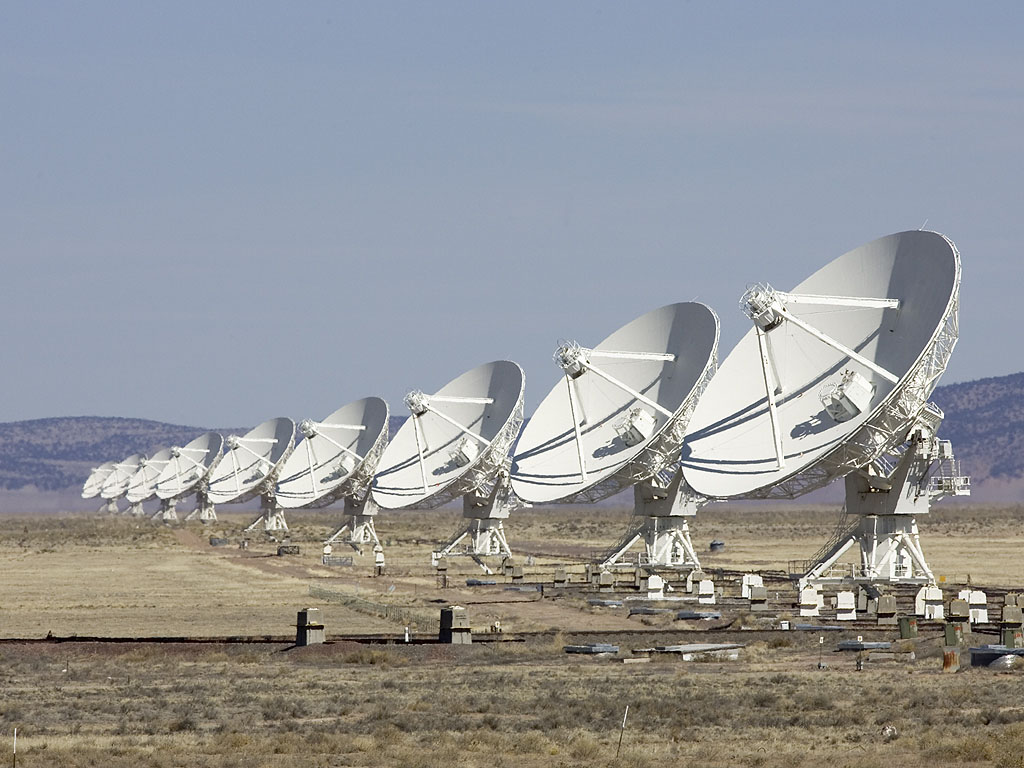
The field this paper recounted is GOODS-N, as the VLA imaged it at 10 gigahertz. The VLA is a radio telescope made of 27 dish antennas laid out across the New Mexico desert, and its full name is the Karl G. Jansky Very Large Array. The antennas can be drawn closer together or pushed farther apart, and the wider the spread, the smaller the detail it can separate. The image the team worked from combines 380 hours across the A, B and C configurations at a resolution of 0.22 arcseconds. One arcsecond is a degree divided by 3,600, so 0.22 arcseconds is about a fifth of that.
The patch itself is small. A single pointing sees only a narrow field, so 17 of them were overlapped to cover 297 square arcminutes, which leaves the sensitivity nearly flat across the middle. That area is less than half the sky a full moon covers. Staring at so small a patch for 380 hours produced this image, and the catalog drawn from it is what the fake-counting runs on.
The mismatch was first noticed by the same team. Working on this field in 2024, they saw that blurring the image to a coarser resolution left fewer points in the flipped version. If the noise patches had nothing to do with one another, changing resolution should leave the gap between calculation and measurement untouched. This paper is the follow-up that measured that hint again across eight resolutions.
The team checked the noise first. At all eight resolutions the pixel brightness distribution matched a zero-centered Gaussian well, with no stretch where the dark tail ran unusually heavy. By the textbook, then, the fakes should come out exactly as calculated. The fakes actually counted were far more numerous.
Counting the Fakes by Flipping the Image
Deciding object by object which catalog entries are real would mean matching each one against observations from other telescopes. That takes a great deal of work, and faint objects the other telescopes missed get branded fake unfairly. Radio astronomy takes a different route. It multiplies the image brightness by minus one and runs over the flipped version the same detection program it ran over the real one.
A bright point found in the flipped image is a dip in the original. Nothing in the sky is a radio source darker than its surroundings, so every one of those points is noise. If the noise is symmetric about zero, their number is the number of fakes mixed into the original. Dividing the count from the flipped image by the count from the real one gives the spurious fraction. Every rate quoted in this article was measured that way.
The team took the 0.22-arcsecond image and smoothed it into seven more, from 0.25 arcseconds up to 1 arcsecond, then ran the same procedure at all eight resolutions. Detection used PyBDSF with the threshold set at five times the noise level. Switching the program to Blobcat changed nothing, and neither did lowering the resolution in the observation data instead of smoothing the image. The result pointed the same way at every resolution. Per independent noise patch, the chance of a fake exceeded the Gaussian prediction. At 0.22 arcseconds it ran nine times over, and blurring toward 1 arcsecond brought that multiple down to four. Most of the fakes sat among faint points with a signal-to-noise ratio of 6 or below.
Three Suspects, and None of Them Explains the Excess
More fakes at higher resolution is not surprising on its own. Cutting the same stretch of sky into finer pieces raises the number of independent noise patches, and more patches mean more of them crossing the threshold by chance. That effect sits in the formula from the start. The nine-times figure is what remains once it has been divided out.
Next the team turned to the edge of the image. An antenna receives most sensitively along the direction it points and grows duller outward. Correcting for that difference amplifies the noise along with everything else at the edges, so fakes can pile up there. The team cut out the central region where antenna sensitivity stays above 80 percent and counted again. Nine times over came down to seven, and no further. The edge effect is real, and it accounts for little.
The leading suspect was the way the image gets made. A radio interferometer cannot use its observation data as an image directly, and reconstructs one through repeated computation instead; that algorithm offers several choices. The team picked one of the 17 pointings and reimaged it five different ways. Wide-field correction in and out, the multi-frequency approach against the classical one, and a version that splits the field into facets and treats them separately. The spurious fraction of all five landed between 0.25 and 0.40, and within the errors none could be told from another.
One of the five is the exact recipe used to build the actual GOODS-N catalog. The other four change that choice one piece at a time, and not one of them made fewer fakes. The 0.25 to 0.40 range comes from reimaging a single pointing and counting there, so it does not carry over as the rate for the whole survey catalog. What the number does show, on its own, is that the fakes are not a stray one or two.
This comparison is the most important stretch of the paper. Had the problem been one that better imaging could fix, five methods would have no reason to agree. That all five landed in the same band means the fakes were not born at the imaging stage. The trouble lay upstream.
Dirty-Beam Sidelobes Tie the Noise Together
A radio interferometer is not a device that photographs the sky with one dish. It reconstructs an image by stacking a great many measurements, each one pairing two antennas and comparing their signals. Every pair has its own separation and direction, and what that pair measures is plotted as a single dot on an imaginary map called the uv plane. With 27 antennas there are 351 pairs, and as the Earth turns the dots sweep arcs across the map. Even so the map never fills. Holes are left.
Those holes leave a mark on the image. Even when the sky holds nothing but one perfect point source, the reconstructed image draws a faint ring pattern around it as well. That pattern is the dirty beam, and the bright and dark rings growing around the central peak are its sidelobes. Spreading the antennas farther apart for sharper resolution widens the holes in the map and makes the sidelobes more pronounced. Resolution and the holes are traded against each other.
Sidelobes do not attach only to real objects. They attach to noise in the same way. The team measured the autocorrelation function of the image noise and showed this point directly. The autocorrelation function is a curve recording, distance by distance, how much one pixel's value moves together with a neighbor's a short way off. If neighbors were unrelated, a single sharp peak would stand at the center and the rest would lie flat. In the 0.22-arcsecond image, clear negative troughs dipped symmetrically around the central peak, spaced at roughly the beam size. In the version smoothed to 1 arcsecond, the same curve went smooth and the troughs all but disappeared. The measurement used the ESSENCE package, which implements an autocorrelation technique proposed on the galaxy-observation side in 2023.
What happens when the noise is tied together? The formula that counts fakes was built on the assumption that every noise patch is independent of the others. In practice the sidelobes tie the patches so they rise and fall as one, and when a deep trough opens in one place its surroundings sink along with it. Deep troughs appear far more often than independence would allow, and those troughs cross the threshold and land in the catalog. That is where the formula loses its fakes.
The sentence the authors put in their conclusion is unambiguous. High angular resolution does not by itself produce more spurious sources. Reaching very high resolution usually calls for spreading the antennas far apart, an observation gathered that sparsely builds a beam with strong sidelobes, and that beam brings in correlated noise which raises the count of fakes. The larger number of independent noise patches and the residual edge effects add something as well, though they cannot carry the whole excess.
The recommendation that follows points at the observing side rather than the imaging side. The next generation of interferometers now being planned, the ngVLA and the SKA, should be designed to fill the uv map densely enough and not simply to push resolution higher. Otherwise every gain in resolution brings a matching gain in the fakes mixed into the catalog. Whether some other reconstruction algorithm could soften the effect of sparse sampling they left as work for later.
Which Stage Does the Error Come From?
What follows is not in the paper. It is written down because the shape of this study shows up in other places where data gets handled.
When a training dataset throws up strange labels or errors nobody can account for, the first place hands reach is usually the back end. Label-cleaning rules get adjusted, another model goes on top to screen outliers, review criteria get tightened. The five-way imaging comparison in this paper is exactly that reach. And all five returned the same answer. Some errors do not move no matter how the processing stage changes.
They did not move because they were not made at the processing stage. The moment the antenna layout is fixed, the holes in the uv map are fixed, and the moment the holes are fixed, so is the shape the noise will clump into. A property settled before the observation even begins cannot be erased once the image is out. Data collection design does the same work. The moment someone decides where and how many sensors go, which hours and which user groups get captured how often, and on what basis labelers are chosen, the shape of how that data will be wrong is settled with it.
One more thing stands out, which is that the noise looked perfectly healthy from the outside. The pixel distribution fit a Gaussian well and the dark tail was not heavy. Had only the usual distribution checks been run, this image would have passed. The problem surfaced when someone looked at the relationships among the values rather than at the distribution of each one. The same thing happens wherever data quality is measured by distribution metrics alone. If the missing-value rate and the duplicate rate both stay under their thresholds and the model still fails in one particular range, the thing to look at is not each field but how the fields move together.
The last point is the trade. Drop the resolution to 1 arcsecond and nine times over falls to four. Fewer fakes, at the cost of the ability to separate small structures. Every attempt to measure more precisely pays that same price. The more often and more finely you collect, the more gaps go unfilled, and the more correlated errors those gaps create. A plan to raise precision that carries no plan to raise collection density alongside it will see the fakes rise as far as the resolution did.
Editor's Note
There is a question Pebblous keeps coming back to when looking at data quality. Was the error being fixed right now made at the processing stage, or settled already at the collection stage? Radio astronomy holds one tool for answering it. Flip the image, count what should not be there, then change the processing method and watch whether that count moves. If it does not move, look further upstream. The procedure is worth borrowing outside astronomy. This connection, though, is this article's reading and not a claim the paper makes.
Thanks for reading this far. The full paper is at arXiv:2610.02028, and it is due to appear in volume 100 of Revista Mexicana de Astronomía y Astrofísica. Every figure quoted here was checked against the text and the plots. If you have ever caught an error that your collection design had already locked in, we would be glad to hear what gave it away.
Pebblous Data Communication Team
October 4, 2026