Executive Summary
Asteroids spin at their own speeds, each one like a top. Working out how long a single turn takes is simple in principle. Photograph the same asteroid enough times and read the rhythm in its brightness. The catch is that the rhythm only becomes visible once enough photographs have piled up, and the observations the Vera C. Rubin Observatory in Chile left behind during its 2025 to 2026 test operations fall well short of that. Most objects were caught a few dozen times over a day or two and then left alone for weeks. A paper posted to arXiv on September 24 by Valerio Carruba of São Paulo State University in Brazil and nine co-authors turns the question around. Rather than gather more photographs, the team first calculated how photographs have to be arranged before an answer can appear at all. This article looks at what that calculation settled.
The team took one well-observed asteroid and threw most of its record away on purpose. They divided the observations into a handful of time clusters, varied how wide each cluster opened, kept only 30 points, and checked ten times over whether the original rotation period still came back. Under the tightest setting, two clusters and the narrowest window, one method failed all ten times; with four clusters it succeeded all ten. The photograph count never moved. Applying that same standard to the real observations left 36 of 140 initial candidates standing, and those 36 had been observed 286 times on average. None of this says that sparse sampling is good enough. It says where sparse begins, in numbers.
Sections 1 through 4 report what the paper says. Section 5 is the reading this article draws from it.
Key Figures
Source: Carruba et al., arXiv:2609.29841 (accepted at Planetary and Space Science), Sections 5 and 6 and Appendix Table C.7.
0 → 10 of 10
Going from two clusters to four
At the narrowest window the Fourier method recovered the rotation period zero times out of ten tries. The retained sample stayed at 30 points
36 / 140
Objects that cleared the reliability bar
About 26% of the 140 initial candidates drawn from the February and April datasets. No period was reported for the rest
286
Mean observations among the 36 that passed
Close to the 290 recorded for the 76 objects with reliable periods in the earlier First Look sample
2 of 2
Taxonomy checks against the literature that disagreed
Only two objects carried a published classification that could be compared directly, and both conflicted with this analysis
Cutting Down the One Asteroid With a Known Answer
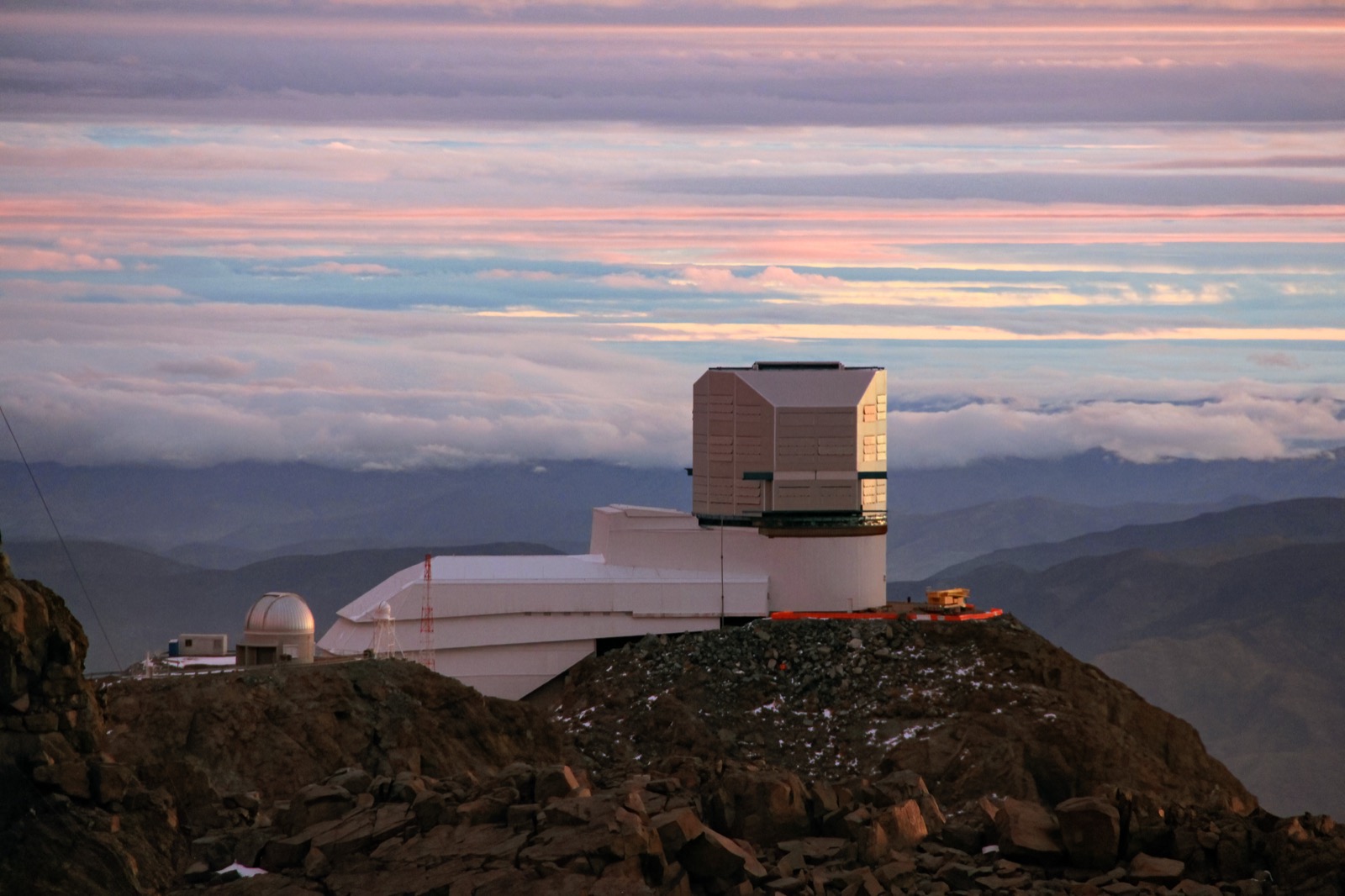
Rubin has not started its main survey. The data piling up now comes out of the work of tuning instruments and procedures, and it differs in character from the First Look release that came earlier. First Look covered nine nights, from April 21 to May 5, 2025, with roughly 340,000 observations across 2,103 objects. On every night but the last, more than 60 exposures were packed into a few hours. Even at that density, reliable rotation periods emerged for 76 objects. The median object was observed 132 times, while the 76 that yielded periods averaged 290. The science validation data used here is thinner. Most objects were caught 165 times or fewer, and even those observations bunch into two or three short stretches. In the February data, only 30 main-belt objects and two near-Earth objects were observed more than 150 times. Same telescope, different density.
Pulling a period out of data like that and calling it a good fit is easy. It is harder to know when that claim stops being true. Checking it requires a case where the answer is already known, and sparse data has no such case. Rather than go looking for a new answer, the team broke an answer it already had.
The test bed was an asteroid called 2026 DO14. It was observed 259 times and completed a full rotation within a single night. Its period runs about 1.9 hours and its brightness swing is large. It is the best-observed object in the paper, and one the authors pin down as "a particularly favorable validation case." It is also a super-fast rotator, a body less than 0.1 km across turning in under two hours. The batch submitted to the Minor Planet Center on February 27 consisted of one object photographed 259 times, a high-cadence sweep of the COSMOS and M49 fields, and that object is 2026 DO14. The sample that served as ground truth was not picked out of the rest of the data. It exists because it was photographed differently.
Three handles cut that record down. How many temporal clusters to place across the observing span (two, three, or four), how wide to open the window around each cluster (half-widths of 0.008 to 0.014 days, roughly 12 to 20 minutes), and how many points to keep inside them. The last handle was fixed at 30, the same per-band minimum the First Look paper had used.
That fixed count carries the whole experiment. With 30 points retained every time, any change in the result comes from how many separate sittings those 30 points were spread across, not from how many photographs were taken. Gathering more data cannot answer that question. Only cutting down the data already in hand can.
Each thinned dataset was redrawn at random ten times and refitted, and a result within ±10% of the original period counted as a recovery. Ten is not many, and the paper says as much in advance. The recovery rates that follow should be read as rough gradations rather than precise probabilities.
How Two Methods Hold Up as Data Thins
There is more than one way to find a period, and this paper ran two very different ones side by side. The first is a high-order Fourier model (HOF), which lets the shape of the light curve run free and settles the number of terms with statistical tests. Flexible, but prone to mistaking twice or half the true period for the answer once data runs short. The second is a multi-band Lomb–Scargle model (LSM), which fixes the curve shape at second order and instead ties the brightness in four color filters (g, r, i, z) to one shared period and fits them together. That one trims the degrees of freedom so the search has less room to wander.
The table below holds what each method returned on the thinned data. Every cell is the number of times out of ten that the fit came back near the true value.
Read the table down a column and the direction shows. In the top-left cell of the left block, two clusters and the narrowest window, HOF missed all ten times. LSM got six under the same conditions. Move to four clusters and both methods land near the answer almost every time. Throughout, the sample was 30 points.
The sentence in the paper's conclusion comes from here. Reliable HOF periods need at least three temporal observation clusters. Look at an object with a 1.9-hour period through two 20-minute windows, and which stretch of the curve you happen to catch is left to chance. Adding clusters does not add observations; it spreads them across the rotational phase.
That is also why both methods were run. The team built a wrapper procedure on top that compares the two results and decides whether to trust them. It sets four conditions, and one failure means no period gets reported for that object.
- • At least one of the two methods has to return a valid period.
- • The object has to be observed more than 30 times in each of at least two of the g, r and i filters.
- • The brightness swing has to exceed 0.1 magnitude, which means the signal has not sunk into the noise.
- • If both methods return a value, the two periods have to agree within 10%.
Those four came straight from the First Look paper. This work adds the procedure that pits the two methods against each other, and the thinning experiment that pins down when the criteria break. The paper attaches a footnote warning against over-reading the agreement: both approaches lean on the same photometry and share some assumptions about rotational variability, so a match between them is a consistency check between independent implementations rather than evidence that the periods carry no systematic bias. The same passage argues the other side as well. The two methods differ in how they select Fourier order and in how they correct photometry, and solutions that agree despite those differences are that much less likely to be artifacts of one implementation's habits.
The Same Bar, Applied to Real Observations
The team ran this procedure over the Rubin data submitted to the Minor Planet Center in February and April 2026. February started with 84 candidates and April with 56. Counting those 84 involved one judgment call. To avoid losing objects prematurely from the smaller batches, the team lowered the threshold of 30 observations in two bands to 10 for the batches submitted on February 9, 16 and 27, and February 9 alone turned up 311 additional candidates. Their light curves proved uniformly sparse and their periods untrustworthy, so the relaxed criterion was withdrawn for that batch. The 84 that remained are 23 from February 3, 60 from February 12 and one from February 27. Sixteen survived in February and 20 in April. Together that is 36 of the 140 initial candidates, about 26%. On the February side, 68 of 84 dropped out, a failure rate of 81%.
The reasons for dropping out repeat. Sparse light curves, observations bunched into one or two stretches, spurious peaks in the period spectrum, poor photometric quality. In four objects the Fourier method also settled on twice the true period, which forced a refit restricted to single-peaked solutions. The unconstrained fit for 2010 TA205 had landed at about 6.692 hours; under the restriction it dropped to about 3.346 hours, matching the Lomb–Scargle value of 3.343 hours.
One number the paper records without fuss is worth pausing over. The 36 objects that passed had been observed 286 times on average, with a standard deviation of 180. The 76 objects with successful rotation periods in First Look averaged 290, standard deviation 110. Effectively the same figure.
Building a way to extract periods from sparse data was the goal, and yet the objects that cleared the bar had been observed at roughly the old density. The method did not lower the requirement. It made the requirement legible. Without deciding in advance what to let through, this number never surfaces at all. The paper leaves one line on it in the conclusion: data quality, rather than methodology alone, is the principal limiting factor in early Rubin analyses.
Nor does 26% say anything about Rubin's future. These observations were gathered under differing strategies during test operations, and the paper expects the pass rate to climb once the main survey accumulates longer and more even coverage. How far it climbs is left outside this work's scope, pending data yet to come. The caution against reading the yield as a performance figure appears twice, once beside the result and once in the conclusion.
Two further results came from the surviving 36. Five more super-fast rotators, which the paper defines as periods under 2.2 hours, turned up alongside 2026 DO14. At the other end sits a control case of sorts. Asteroid 3021 Lucubratio came out at 12.08 hours against the 12.09 hours on file in the Lightcurve Database. A match on an object whose answer was already known is a sign the procedure works as intended.
The Paper Does Not Hide Where Its Results Disagree
Color comes after period. The makeup of an asteroid's surface is estimated from the differences in brightness between filters. Classification of this kind has mostly leaned on three filters, g, r and i, which carries you about as far as separating carbon-rich bodies from silicate ones. This paper adds the z filter, which sits where absorption features near one micron show up, so components that blur together under three filters separate out.
Rotation makes this awkward. An asteroid keeps changing brightness as it turns, and images taken while swapping filters do not capture the same instant, so subtracting them directly yields rotation mixed into the color. The team fit all four filters to one shared period with a separate brightness offset per filter, removing rotation's share before deriving colors. Twenty-five objects received a classification: five D-type, five S-type, ten L-type and four X-type.
The paper does something here that is not routine. Right beside the results, it writes down where those results do not line up.
- • Both objects that could be checked against the literature disagreed. Published taxonomies exist for three objects in the sample, and only two of them could be compared directly. 92048 came out D-type here against S-type in the literature, and 2015 MA122 L-type against S-type.
- • The colors diverged before the classifications did. Seven objects had color indices that could be matched against the literature, and four of them differ by more than 0.1 magnitude, the paper reports. The widest gap is again 92048, at 0.28 magnitude.
- • Other evidence points the same way. 92048 has a moderate geometric albedo, and that value does not support the D-type call made here. The team writes that its own classification is uncertain.
- • The two methods split on one object. 2017 SC180 is S-type under Lomb–Scargle and C-type under Fourier. The paper records alongside it that both reflectance spectra look closer to an S-type shape.
- • The samples do not overlap. Four February objects had periods pinned down by the Fourier method, and two of those also received a classification. The other two had never been photographed in the z filter, so no color could be derived.
Sparse sampling cannot take all the blame either. Of the objects whose colors were matched against the literature, only 2015 MA122 is not sparsely sampled, and it happens to be one of the two taxonomy mismatches. The paper attributes that case to the known degeneracy of broadband taxonomy. Even 2026 DO14, the best-observed object in the sample, shows an i-band reflectance well below what a D-type would predict, and residual rotational modulation cannot account for it, so the origin is left unresolved.
So the paper calls these classifications candidates rather than conclusions. The external checks, it says in the body, "do not constitute a robust validation," and the conclusion repeats the point. The judgment running through those sentences is that knowing what wobbles when data thins beats adding a few more results.
One more thing. The procedure is not fully automated. While candidates are being filtered, a person looks at light curves and period spectra and makes a call. The paper lists the step as a limitation and hands the job of replacing it with objective quality metrics to future work, as a prerequisite for large-scale processing. The analysis code is published on GitHub.
Why Pebblous Is Watching This Paper
From here the paper gets read again through a data-quality lens.
The sentence heard most often in data quality work is that there is not enough data. Ask a follow-up and the answers usually stop. How much would be enough? Where did the judgment of insufficiency come from? Has anyone actually tested how far the data on hand can carry a claim? Without answers to those three, "not enough" is a feeling rather than a diagnosis.
This paper put the three questions in order. Instead of waiting on new observations, it took one sample whose answer was known and cut it down until the answer began to fall apart, then used that point as the bar for filtering real data. Some objects passed and some did not, and for the 104 that did not, no period was written down. Writing nothing beats writing something wrong, and here that judgment is set into the procedure.
Our own work in data diagnosis has the same shape. Before asking whether a label is correct, we look at the guideline it was written under, whose hands wrote it, and in what order. With those conditions on record, a wrong label can be fixed. Without them, even a correct label has nothing to stand on. Writing down as a measurement how far a dataset can carry a claim is the first thing to fall off the schedule before model training, and it returns later in proportion to how far it was pushed.
A controlled reduction is also the cheapest way to produce that measurement. Take a well-covered sample, thin it, and the minimum condition arrives without a single new record being collected. It answers not only how many records are needed but how they have to be spread. In this paper the photograph count was pinned at 30, and what separated success from failure was how those 30 were divided across days and sittings. Missing data and lopsided data are different problems, and the first one's name often gets borrowed for the second one's situation.
Pebblous has looked at the Rubin Observatory before. We covered separately what to trust among the alerts it will pour out every night, and we once wrote about a detection limit calculated before the instrument had even launched. The three stories meet in one place. Data accumulates faster than anyone decides what may be said with it, and false confidence grows in the gap.
So the question that remains takes this form. Is our data genuinely insufficient? Or have we simply never measured where the shortfall begins? If the first, collect more. If the second, collecting more changes nothing. Telling the two apart calls for no new data, just a day spent cutting down what is already there.
Thank you for reading this far. The paper this article followed is available in full at arXiv:2609.29841, and the First Look paper it builds on appeared in ApJL. If you find a document in your organization that says the data is insufficient, open it, see which experiment that judgment came from, and tell us what you find.
References
- 1.Carruba, V. et al. (2026). "Extracting Asteroid Physical Properties from Vera C. Rubin Observatory Science Validation Survey Data: Rotational Periods, Colors, and Taxonomies." Planetary and Space Science (accepted), arXiv:2609.29841.
- 2.Greenstreet, S. et al. (2026). "Lightcurves, Rotation Periods, and Colors for Vera C. Rubin Observatory's First Asteroid Discoveries." The Astrophysical Journal Letters, 996(2). DOI: 10.3847/2041-8213/ae2a30.
- 3.Mastropietro, M. (2026). "Rubin-Asteroid-Analysis-Pipeline (v0.1.0)." GitHub — public analysis-code repository for Carruba et al. (2026).