Executive Summary
A paper published in Nature on August 26 reconstructed the jet of blazar 3C 345 as a single video. The raw material is 116 observations taken by the VLBA at 15 GHz between 1995 and 2022. Radio interferometry has always produced one still image per observation and then laid the stills out in chronological order; an algorithm called kine instead fed all 116 into one neural network and solved for a function that is continuous in time. The work comes from IAA-CSIC in Spain, Caltech and the University of Toronto, and one of the authors, Katherine Bouman, is the computational imaging researcher known for the algorithm behind the Event Horizon Telescope's black hole image.
When a video is continuous in time, any moment can be sampled from it, and the motion between frames can be computed. The team applied optical flow to that video and measured the instantaneous speed of the plasma at every point on the screen. The older approach could only measure how fast a handful of conspicuous bright blobs moved. The observations over those 27 years were sparse, though, and to sample frames at regular intervals the model supplied frames for the moments where no observation exists.
The paper does not hide this. The Methods section states that interpolated frames as far as 5.7 months from the nearest observation were used in the optical flow analysis. Measurement and interpolation live inside the same video, and what tells them apart sits on the timeline beside the video rather than in it. Anyone who has ever built a screen out of filled-in gaps will recognize the arrangement.
Key figures
Source: Foschi et al. (2026), Nature, DOI 10.1038/s41586-026-10988-5, main text and Methods
116
observations solved together
3C 345, VLBA 15 GHz, 1995 to 2022
113 μas
effective resolution in validation
4.2× the nominal 475 μas set by the diffraction limit
5×10⁵
dynamic range achieved
two orders of magnitude above CLEAN at 3.6×10³
5.7 months
farthest an interpolated frame sits from an observation
that frame was used in the velocity calculation
116 observations went into one function
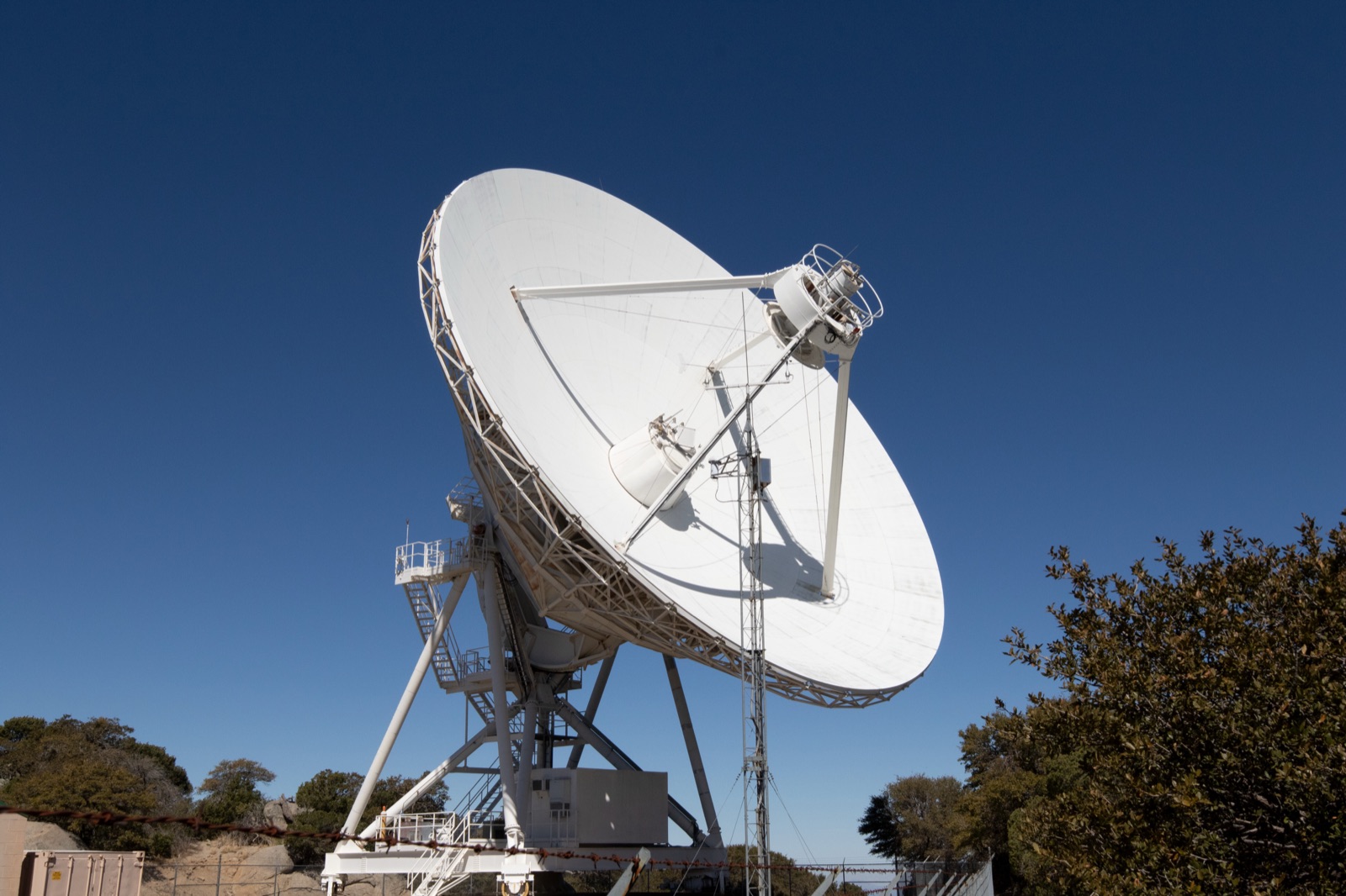
VLBI links radio telescopes across the planet so that they work as one telescope the size of Earth. Signal from the places where no telescope stands is never collected, so turning what was collected into an image is, from the outset, a problem without a single determined answer. The long-standing standard was CLEAN. One observation yields one still image, and an observation from another epoch becomes a separate image. String those images together in order and the video jitters, because the noise structure differs from frame to frame.
kine builds a function instead of an image. Feed it right ascension, declination and time, and a single neural network returns the brightness and polarization at that place and moment, standing in for the entire video. The architecture is modest: four layers for total intensity, six for full polarization, 256 nodes per layer. During training the spatial coordinates are sampled evenly on a 200 by 200 grid and the time coordinate follows the actual observation dates. Fitting all 116 datasets to this one function took about 1.3 hours on four A100 GPUs.
Solving them together is what lets frames borrow information from one another. Some epochs have poor data because of weather or telescope availability, and the epochs on either side prop up the thin spots. The borrowing is indirect. Nothing tells the network that a jet ought to look a certain way; instead the correlations between frames are enforced implicitly as the network learns them. The paper calls this implicit regularization rather than explicit morphological priors, which is why it works regardless of the type of source and leaves few hyperparameters to tune by hand.
Two things came out of it. The effective resolution averages 113 microarcseconds in the synthetic validation, 4.2 times the nominal 475 microarcseconds set by the diffraction limit. The dynamic range reaches roughly 5×10⁵, about 140 times that of traditional methods.
Of those two, the one that simultaneous reconstruction actually changed is the dynamic range. Resolution already improves by a factor of 3.8 when a single epoch is reconstructed without the time axis, and solving all 116 together brings it to 4.2, which is not much of a difference. The dynamic range on the real 3C 345 data, by contrast, was 3.6×10³ for CLEAN, 4.9×10⁴ for kine reconstructing one epoch at a time and 5.1×10⁵ for kine solving all 116 together. Two orders of magnitude. The gap widens, the paper notes, for the epochs with poorer data. These multipliers should not be copied out as fixed specifications of the algorithm, though. The improvements in resolution and dynamic range depend on the quantity and quality of the observations, and the authors say so in the sentence immediately before they report the numbers: they should not be intended as intrinsic performance gains independent of dataset quality and temporal coverage.
One point is easy to misread because of the algorithm's lineage. kine was originally built for the Event Horizon Telescope's observations of Sagittarius A*, where the source changes during a single observing run and no image can be made without putting time into the model. This paper demonstrates the opposite case: a slowly varying source observed repeatedly across 27 years, and the abstract states plainly that this is the case being shown. There is no new image of a black hole shadow in these results.
The speed of the flow, not of the blobs
Measuring speed in a jet has so far meant chasing bright blobs. You fit a Gaussian to a conspicuous component in the image, find where that component has moved in the next observation, and divide the displacement by the elapsed time. A source as heavily monitored as 3C 345 has speeds assigned to individual components this way. What that number gives you is the speed of the blob, not the speed at which the plasma at that spot is flowing.
A video that is continuous in time admits another method. The team applied optical flow, borrowed from image processing, and extracted a local velocity vector at every point in the frame. Values appear where no bright component ever passes, in regions of nothing but diffuse emission. One assumption comes attached, of course: that a shift in the brightness distribution on screen is a shift of the plasma itself, and the paper states that assumption in so many words.
The highest value of the mean apparent flow speed is 12 ± 0.2c, in the southern part of the jet between 1 and 3 milliarcseconds from the core, where most components are ejected. It falls to 9 to 11c within the first 5 milliarcseconds and to 5 to 8c further out in the diffuse emission. Apparent speeds exceed the speed of light because the jet lies close to the line of sight, and converting with the reported viewing angles gives a physical speed of 0.997c. Gaussian fitting on the same source had produced 11.79 ± 0.19c and 13.16 ± 0.17c, the same order of magnitude.
The standard deviation of the speed showed no substantial dependence on location, ranging between 3c and 6c, which the team reads as a sign that the plasma flow is turbulent and its apparent speed changes often. That is the kind of quantity a few blob trajectories cannot produce.
The bright moving components in 3C 345 have long been interpreted as shocks travelling down the jet. Yet the speed of the components came out the same order as the average speed of the background flow in the same region. The bright components run at 10 to 13c and the background plasma in the same place averages 9 to 12c, overlapping ranges. No correlation appeared either between the bright spots and the peaks in fractional polarization. A shock would compress the plasma and align the magnetic field, raising the fractional polarization locally, and it should do so especially in the toroidal field that this jet's polarization structure points to. No such local rise was observed. The team therefore reads these components not as shocks but as regions where magnetic pressure rises locally, emissivity is enhanced and Doppler boosting takes over. Back when only blobs could be tracked, there was nothing to compare against, so the question could not be asked.
How much interpolation is in the smooth video
The MOJAVE monitoring program does not observe at fixed intervals. Averaged over 27 years, 116 observations work out to roughly one every three months, but in practice dense stretches alternate with empty ones. Because a neural field treats time as continuous, an image comes out even for a moment when nothing was observed. The paper describes this as circumventing the issue of irregular observation cadence.
Optical flow requires frames at regular intervals. The video that went into the velocity analysis is therefore not the observation times as they fell, but a resampling at even spacing. The relevant passage in the Methods reads:
kine provides good, motion-preserving time interpolation for frames up to 6 months apart from the nearest observations. In the present work, we use time-interpolated frames in the optical flow analysis to have a video sampled at regular intervals. The longest separation between an interpolated frame and the nearest observation is 5.7 months, which is within the range of reliable interpolation.
That six-month limit was established on synthetic datasets built to resemble the morphology, coverage and noise of the real 3C 345 data, and the sentence quoted above is scoped to data of that coverage and quality. The details of frame interpolation and the limitations of the optical flow analysis, the authors note, are discussed in the Supplementary Information rather than the main text.
The same paper handles a gap the opposite way elsewhere. For the time-averaged polarization, only frames from June 2001 onwards were included, because polarimetric data are missing between 1995 and 2000. That gap was dropped from the calculation rather than filled. This is not a contradiction. A time average should be an average of values that exist, and a velocity field can only be computed from consecutive frames, so the same missing data is handled differently depending on the purpose. What the reader of the output cannot see is which calculation filled the gap and which one excluded it.
Lay the times when data exist and the times of the frames used in the analysis on the same axis, in two rows, and the structure becomes visible. The top row is the days on which observations actually happened over 27 years; the bottom row is the even spacing optical flow demands. Wherever the two rows fail to line up, what fills the space is an image supplied by the spatio-temporal correlations the model learned, and at the widest point that distance is 5.7 months.
Who tells the filled frames from the measured ones
The paper does have a device for telling the two apart. It is one line in the caption of Figure 1: the dates corresponding to the selected frames are marked red on the timelines. If you want to know where the observations sit, that timeline will tell you.
The device stops there. Nothing in a frame itself says whether that image came from an observation or from interpolation. For an astronomer reading the paper from the start this is no problem. They will have read the Methods and looked at the timeline. The mismatch arises once the video leaves the paper. What travels in the press release, the conference slide and the social media post is a smoothly flowing jet, not the timeline printed beside it.
It would be a different story if the marking were technically demanding, but it is not. The list of observing dates is already in hand. A dot in the corner of the frame, or a different border color during interpolated stretches, would do. The reason it was not done is priority rather than capability. Where should that marking live: on the image that meets the eye first, or on the auxiliary plot that explains the image?
The same question exists outside astronomy. A time series whose gaps were filled from neighboring values, a dashboard where a model covered the stretch with no responses, a map colored in even over regions with too few samples. On screen, a filled value and a measured one are drawn with a line of the same weight. Physical verification of generative world model video, which Pebblous covered earlier, was a case of plausibility standing in for observation, and kine sits at the opposite end. It is a reconstruction in which measured data pull hard on every frame. Look at the screen alone, though, and the two are equally smooth.
Whether the duty to mark the difference belongs to whoever built the tool or to whoever cites the result has no settled answer. But in a case like this one, where the authors already know which frames are observations and which are interpolations, there is no reason that information cannot follow the video onto the screen. The observed data are in the MOJAVE archive and the reconstruction and analysis notebooks are on GitHub, so which frame corresponds to which observing date can be checked.
References
- 1.Foschi, M., Zhao, B., Fuentes, A., Bouman, K. L., Gómez, J. L., & Levis, A. (2026). "Video reconstruction of variable VLBI observations with neural fields." Nature. DOI: 10.1038/s41586-026-10988-5