Executive Summary
Data quality work usually finishes before training starts. You apply filters, review labels a second time, drop the outliers. But when the model is already deployed and the ground truth will never arrive, where can that review happen again? A paper posted to arXiv on August 24 opened one such place. Co-authored by an ESA researcher, it takes a single prediction from the spectroscopy pipeline of the Ariel mission, which will observe exoplanet atmospheres, and traces it back to the training samples that produced it.
The key was changing what influence is measured against. The classical influence function measures how much a training sample moves the test loss, and computing a loss requires the true label. The authors moved the quantity of interest from the loss to the model's prediction itself. It became a quantity computable without ground truth, and the full influence matrix across five cross-validation folds came out in 1 minute and 15 seconds. Doing the same work by actual retraining would take about 24 hours.
One condition sits over all of this. Ariel has not launched yet, and the validation ran on a public simulated dataset. The harmful samples the paper points to are not settled verdicts either, but flags marking high-risk contributions. The authors state plainly that with true labels unobserved, no actual degradation is guaranteed.
Key Numbers
Source: Grens et al., arXiv:2608.23458 (2026-08-24)
1 min 15 s
Time to compute the entire influence matrix
Across all 5 folds, each holding 6,810 training points. Checking the same set by actual retraining would take about 24 hours
0.81
Rank correlation between risk score and realised error
On shape-based spectral error, with 0.69 on the magnitude-based measure. Ground truth was used for this comparison alone
6-fold
Magnitude gap of the top influential samples
Their shape matches the nearest neighbours almost as well, while magnitude dissimilarity widens sixfold. Influential samples are not lookalikes
6 of 10
Overlap between the most influential and the most harmful
In both the 0.55 µm visible and the 4.3 µm infrared channel, six of the top ten were the same samples
Ariel observes without ever seeing the answer
Ariel is the European Space Agency's M4 medium-class space telescope, due to launch in 2031. It will leave from French Guiana aboard an Ariane 6, settle into a halo orbit around the Sun-Earth L2 point, and take spectra of the atmospheres of roughly 1,000 exoplanets. ESA calls this a chemical census. Its launch mass is 1,400 kg, its collecting area 0.64 m², and it carries two instruments.
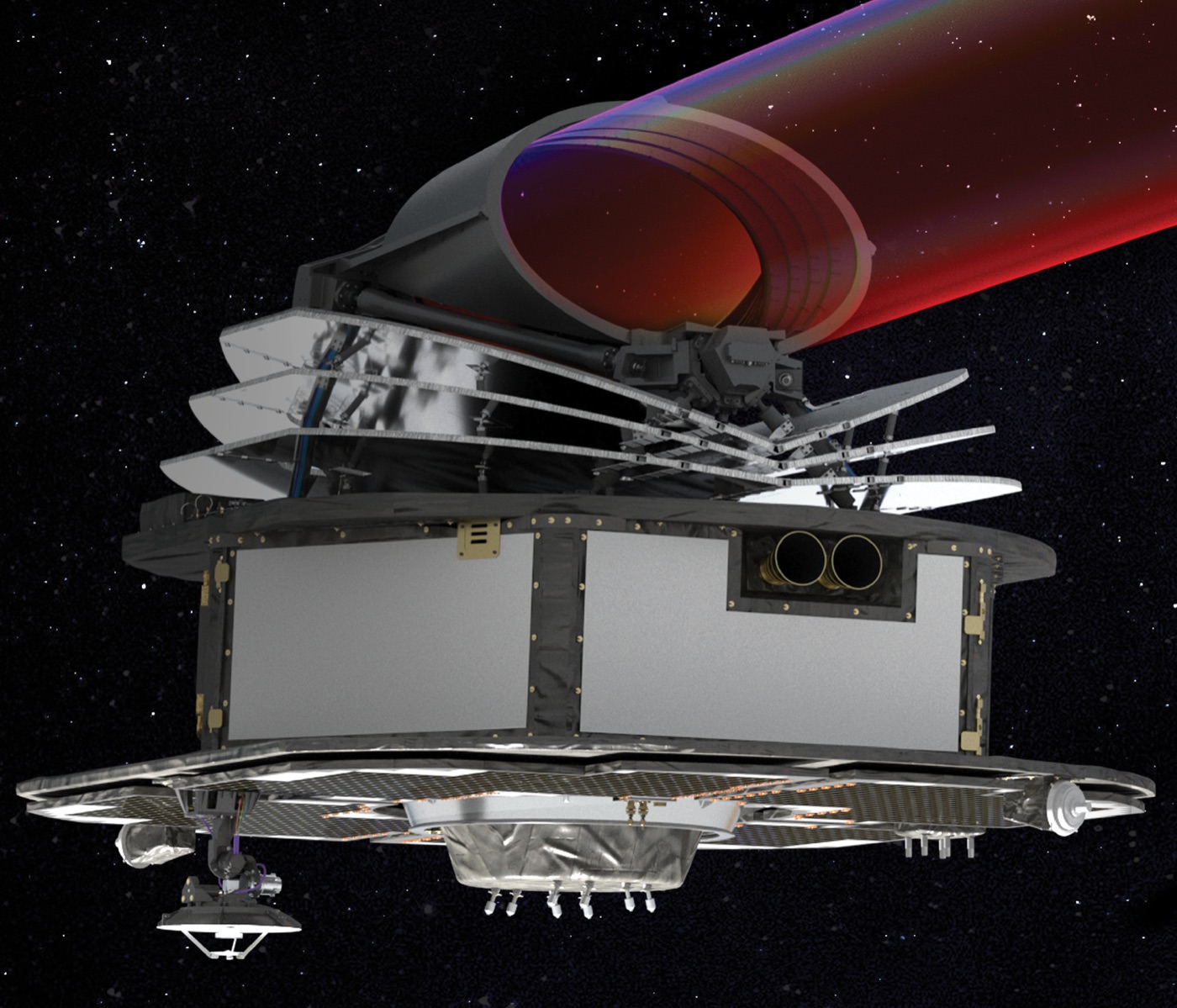
The observing principle is transit. While a planet passes in front of its host star, part of the starlight filters through the planetary atmosphere and leaves wavelength-specific molecular signatures behind. What Ariel receives is a time series of brightness variation per wavelength, and machine learning enters at the stage where the atmospheric transmission spectrum is recovered from that. The paper places this role as a complement to the classical retrieval pipeline rather than a replacement for it. Machine learning is also used on the side that infers atmospheric properties from spectra, but the task this work addresses is predicting transmission spectra directly from light curve data. In Ariel's data processing terms, that is the step from L2 to L3.
The trouble is that this pipeline cannot be graded. In a laboratory you would measure the answer separately and check the prediction against it, but an observation taken in orbit has no reference value to compare with. Whether a prediction makes physical sense has to be established some other way, and that is what turns interpretability from a convenience into a means of validation.
1.1Plenty of tools interrogate the inputs, few interrogate the data
Say explainable AI and most people picture feature attribution, methods like SHAP or LIME that ask which input variable pushed this prediction. The paper heads somewhere else, toward training data attribution: which training samples shaped the model's behaviour in generating a particular prediction. When a spectrum comes out looking strange, what you want to know is often less about which of the 55 channels contributed and more about which observations this model learned that from.
The most honest answer is to remove them one at a time. Take out a single training sample, retrain, and watch how far the prediction moves. The result is exact. The cost is one retraining run per sample, and the paper states flatly that this is computationally expensive even for models that train rapidly. Influence functions substitute an approximation for that retraining. Originating in robust statistics and adapted to machine learning in 2017, the tool estimates, through the inverse Hessian, which way a test prediction moves when a training sample is upweighted by an infinitesimal amount. Being a first-order approximation, it carries a caveat of its own: for standard non-linear models it can deviate from the true effect as influence magnitudes increase.
The classical formulation, though, contains one part Ariel cannot use. Influence is defined as the change in test loss, and computing a loss requires the true label for that test sample. How the sign is read is bound up with the same thing. Positive means the loss goes up, therefore harmful, negative means helpful, and that reading holds only where a loss can be measured. Ariel in operation has no such label.
One condition is worth setting down before going further. Ariel is scheduled for launch in 2031 and is not in the sky yet. The data this study used is the public simulated dataset of the Ariel Data Challenge 2021, and the paper validates the framework on the ground in advance, under an assumed post-launch operating condition. Because it is simulated, the ground truth does exist, but the authors kept it out of the method and used it only to score the results.
Shifting from loss to prediction removed the need for labels
What the authors changed is one thing: the quantity of interest. Instead of how much a training sample moves the test loss, they ask how much it moves the model's predicted value itself. The loss takes the true label as an input; the prediction does not. The paper describes this as a conceptual transition that does not introduce new modelling assumptions. In other words, nothing theoretical is surrendered in exchange for dropping the label.
How the sign reads does change. Under the loss-based definition positive meant harmful, but under the prediction-based one the sign only points a direction. Positive means the predicted value rises the moment that training sample is removed, negative means it falls. What matters instead is the magnitude. Values near zero mark samples with a negligible impact on the output for that test case, and large absolute values mark the samples that shift the prediction most. Those are the ones that matter most for validation, because they include both proponents that support the model's physical consistency and opponents that may carry over artefacts of the synthetic training data.
One notational adjustment went into making the sign read that way. The classical expression carries a negative sign in front, and the authors dropped it. Only then does the direction of the value line up with the way the prediction actually moves when that training sample is removed. The paper notes that this changes nothing about the computation and is purely interpretational.
2.1Picking a shallow model meant computing the Hessian only once
The predictive model is an Extreme Learning Machine. It is a single hidden-layer feedforward network whose input weights and biases are randomly initialised and fixed, with only the output weights learned by ridge regression. The choice was not improvised. Models of this family had already been examined as a faster, lightweight alternative to deep learning for exoplanet simulations. Under squared loss the optimisation is convex and admits a closed-form solution. What matters for influence computation is that the Hessian matrix becomes constant here. It depends only on the hidden layer activations and the regularisation term, so it can be computed once and reused for all influence evaluations. The step that a deep neural network has to approximate through Hessian-vector products finishes here as one exact calculation.
The computation itself takes three steps. Compute the training residual, project that sample's gradient through the inverse Hessian to see which way the parameters get pushed, then take the dot product of that with the test sample's hidden layer activations. The experimental setup uses 5,000 hidden neurons with sigmoid activation and a regularisation parameter of 1.0. The data comes from the Ariel Data Challenge 2021, light curves across 55 wavelength channels for 851 exoplanetary targets. What the model receives as input is not spectral features alone. The features extracted from the 55 channels are concatenated with astrophysical metadata such as period, transit duration, semi-major axis, inclination, star temperature, star radius and incident flux to form a single input. Each planet has 100 simulations, 10 distinct stellar spot configurations times 10 photon noise instances, which preprocessing reduces to 10 samples per planet. Cross-validation is 5-fold, split at planet level so that no planet straddles training and test.
Speed is the practical case for this method. Computing the influence matrices across all 5 folds, each holding 6,810 training points, took 1 minute and 15 seconds. The control is actual retraining. The authors picked just five training points per fold and genuinely removed and retrained on each, and those five alone took 1 minute and 5 seconds. Scaled to all 6,810, that is roughly 24 hours. Whether a method can sit in an operational pipeline is decided in that gap.
The samples that moved the prediction were not the lookalikes
Hear the word influence and a particular picture comes to mind: that the training samples which look most like the test sample are the ones that made the prediction. The authors laid the training samples out with t-SNE and coloured them by absolute influence on a specific prediction. The high-influence samples were not clustered near the test point but spread across the training dataset. The paper states in the caption that this figure is illustrative only, not quantitative.
So they asked the same question again in numbers. For one test query, take the 50 training samples closest by Euclidean distance in feature space and the 50 with the largest absolute influence. The feature space used for the neighbours holds the astrophysical metadata described earlier alongside the spectral features, and the 50 on the influence side were selected on absolute values averaged across all 55 channels. Then they measured how far each group's true spectra diverge from the predicted spectrum, split into a magnitude measure and a shape measure. The results are averaged across 1,710 test scenarios.
| How the 50 training samples were selected | Magnitude dissimilarity (RMSPE) | Shape dissimilarity (SAM) |
|---|---|---|
| Nearest neighbours in feature space | 0.1037 | 0.0309 |
| Largest absolute influence | 0.6278 | 0.0380 |
▲ Table 1 of the paper. The shape barely differs while the magnitude diverges sixfold
The two shape values sit almost on top of each other. The high-influence samples match the predicted spectral shape about as well as the nearest neighbours do. The magnitude side opens up sixfold. The reason lies in how influence is composed. Influence is jointly determined by the cross-leverage between the test and training samples and by the magnitude of that training sample's residual. A sample whose spectrum resembles the query hardly at all can still push the prediction hard if the model failed to fit it well. An influential sample is not a lookalike but a point the model is leaning on.
3.1Harmfulness is a flag, not a verdict
This is where the definition of a harmful sample arrives. Thanks to the structure of the ridge solution, a prediction decomposes exactly into a weighted sum of training targets. The weight attached to each training sample is the share that sample contributed to this prediction, and that weight is mathematically equivalent to the cross-leverage between the test point and the training point. The paper describes this decomposition as analogous to what SHAP achieves for input features, only performed on training samples. Feature attribution and training data attribution, separated earlier, meet again here in form. The skeleton, splitting one prediction into parts, is the same; only the thing being split differs, input variables in one case and training observations in the other.
A large share, though, says nothing on its own about whether that contribution is trustworthy. Following the intuition of Cook's Distance, which regression analysis uses to find influential observations, the authors defined harmfulness as the absolute value of the influence multiplied by that sample's training residual. It picks out the observations the model leans on heavily and yet failed to capture accurately during training.
Given that definition, the most influential and the most harmful overlap considerably. The authors checked at 0.55 µm in the visible and 4.3 µm in the infrared, a choice made to see how the model responds across different physical regimes. In each of the two channels, six of the top ten were the same samples. A sample with strong absolute influence climbs the harmfulness ranking even when its individual residual is not particularly large. The precise configuration of points varied by wavelength while the underlying structural pattern held, which the authors read as a sign that the model relies on broad spectral trends.
The paper is explicit about the limits of this metric. A sample marked harmful is not guaranteed to have actually degraded the test prediction, because there is no ground truth to confirm it. What it does instead is serve as a flag for high-risk contribution, sending astrophysicists to inspect those spectra and decide whether to remove or reweight them. It is not an automatic deletion switch but a way of deciding where human inspection should go.
A risk score computed without labels tracked the realised error
Once tracing works, the next question follows. Can you gauge whether to trust this prediction without ground truth? The authors treated influence values as first-order sensitivities and computed how far the residuals of training samples propagate into the test prediction. One conservative assumption enters here. Rather than expecting the errors of training samples to cancel one another, they are squared and summed. Because no compensation is assumed, the score tends to run larger than the truth, on the judgement that overstating risk beats missing it.
The perturbation score produced for each wavelength channel is normalised by the squared predicted amplitude. The same absolute deviation stings more at shallow transit depths. Aggregating those now scale-invariant values across the 55 channels by root mean square yields a risk score attached to a single observation. The structure penalises a large perturbation at any wavelength.
Validation was possible because the data is simulated. Ground truth exists, so the realised error can be computed, and that ground truth was used exclusively for the scoring. A clear monotonic relationship emerged between the risk score and the realised error. Against the magnitude-based error the Spearman rank correlation is 0.69, and against the shape-based error 0.81. That the shape correlation is stronger means the score is particularly sensitive to situations where the spectral form goes astray. The framework itself, which measures error one observation at a time, carries on the same group's earlier work bounding the operational range of spectroscopy models with anomaly detection.
They also checked whether the result holds for one model only. The authors applied the same framework to a gradient-boosted ensemble of 300 sequentially stacked ELMs. For computational efficiency, and on the grounds that under shrinkage later models contribute less to the prediction, influence was computed for the first 30 estimators alone and aggregated after scaling by the shrinkage factor. The result is 0.83 on the shape measure and 0.69 on the magnitude measure. The shape side rose slightly and the magnitude side held.
How well the approximation matches genuine retraining was checked too. A strong positive correlation appeared between the values influence functions predicted and the changes obtained by actually removing samples one at a time and retraining. It captured both the direction and the relative magnitude. A small subset of low-leverage samples landed almost exactly on the diagonal, and the rest lined up along a trend steeper than it. Because the ELM output layer is strictly linear, this divergence does not come from unmodelled non-linear dynamics. It is that full removal in retraining amplifies the effect beyond infinitesimal reweighting, and the leverage factor governs how much.
4.1How much of this is tied to the ELM
A large share of the speed came from the choice of model. Obtaining an exact Hessian in a single pass rests on the ridge structure of the ELM output layer, and that part does not transfer as is. What the paper claims to be architecture-agnostic is elsewhere: the conceptual shift from loss gradients to prediction gradients, the error proxy built by propagating residuals, and the harmfulness criterion defined as influence times residual. Those apply conceptually to any differentiable model. Computing influence in deeper architectures has itself already been studied through last-layer approximations, iterative Hessian-vector product estimators, and random projection methods like TRAK. What deeper architectures trade away is exact single-pass efficiency.
Editor's Note: There is a sequence Pebblous keeps running into in data quality work. The quality effort piles up in front of training, and after deployment only performance metrics remain. In settings where the ground truth arrives late or never arrives at all, even those metrics blur. Medical image reading, industrial sensor anomaly detection and autonomous driving all belong here, fields where results cannot be graded on the spot. The place this paper opened sits in that gap. If taking a single prediction and tracing which data made it is possible without labels and without retraining, then data contribution stops being a value fixed once before training and becomes one recomputed throughout operations. Ariel is simply the setting where that question appears in its most extreme form.
Ariel launches in 2031, and this validation is preparatory work carried out on the simulated data of the Ariel Data Challenge 2021. Pointing at harmful samples is a marking for inspection rather than a settled verdict, and the research was funded by an ESA project on machine learning and artificial intelligence algorithms for exoplanet atmospheres detection and analysis. The paper is available at arXiv:2608.23458.
References
Primary Source
- 1.Grens, N., Simões, L. F., Yip, K. H., & Lueftinger, T. (2026). Traceable Spectral Inference via Influence Functions: Efficient Data Attribution and Error Proxies for the Ariel Mission. arXiv:2608.23458
Academic Papers
- 2.Koh, P. W., & Liang, P. (2017). Understanding Black-box Predictions via Influence Functions. Proceedings of the 34th International Conference on Machine Learning (PMLR, Vol. 70), 1885–1894. arXiv:1703.04730
- 3.Cook, R. D. (1977). Detection of Influential Observation in Linear Regression. Technometrics, 19(1), 15–18. doi.org/10.1080/00401706.1977.10489493
- 4.Nikolaou, N., Waldmann, I. P., Tsiaras, A., Morvan, M., Yip, K. H., & Tinetti, G. (2023). Lessons Learned from the 1st Ariel Machine Learning Challenge: Correcting Transiting Exoplanet Light Curves for Stellar Spots. RAS Techniques and Instruments, 2(1), 695–709. doi.org/10.1093/rasti/rzad050
Official Source
- 5.European Space Agency. Ariel — Atmospheric Remote-sensing Infrared Exoplanet Large-survey. esa.int